Outrank AI

A 2026 benchmark scan found accessibility failures on 95.9% of the top one million homepages, leaving only 4.1% passing its automated checks. The same scan found 56,114,377 total errors, an average of 56.1 errors per homepage, and a 10.1% increase from 2025. The benchmark data changes the starting assumption for an ADA compliance website audit: the question usually isn't whether a storefront has one issue, but which barriers stop customers from finding, selecting, and buying a product.
For Shopify merchants, that distinction matters. A missing alternative text value may reduce understanding, but a filter that can't be operated with a keyboard, a cart drawer that traps focus, or a checkout error that a screen reader never announces can stop a transaction entirely. A useful audit combines automated triage with human testing, maps findings to WCAG criteria, and gives developers enough evidence to fix and retest each issue.
Table of Contents
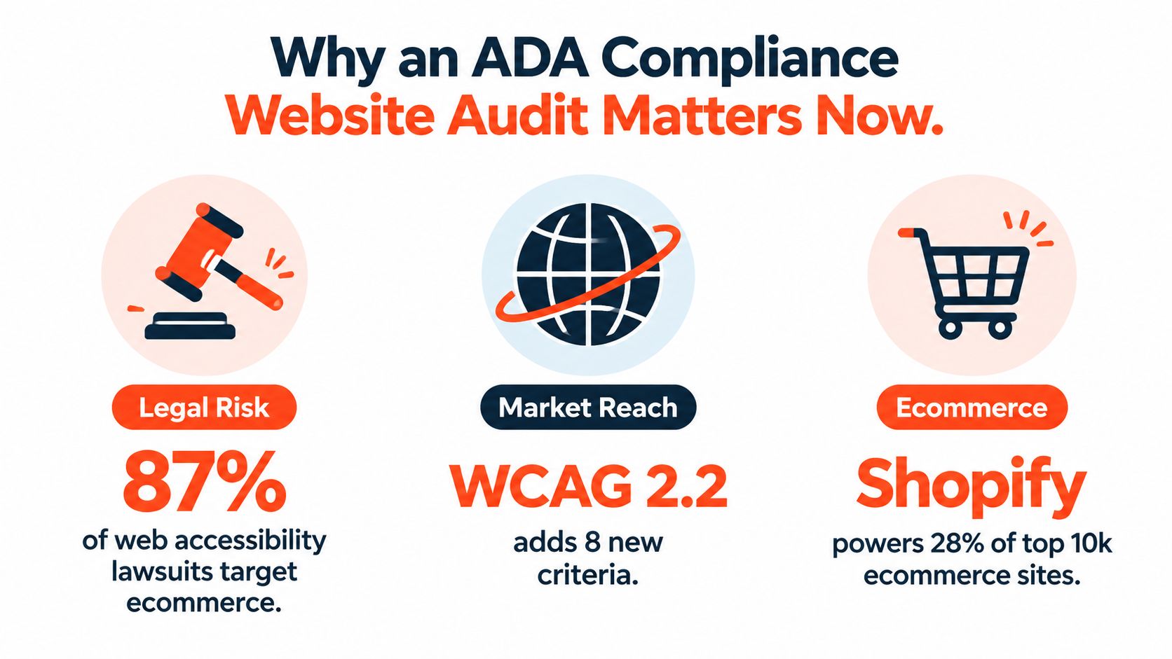
Why an ADA Compliance Website Audit Matters Now
The ADA doesn't provide one simple website checklist. In practice, teams commonly use WCAG success criteria as the technical framework for evaluating whether digital content is perceivable, operable, understandable, and sturdy. Your legal obligations can depend on your business, location, industry, and customers, so an audit is a risk-management tool, not a legal determination.
The benchmark above is valuable because it shows the scale of the problem without pretending that a scanner score proves accessibility. A homepage can pass automated checks while a customer still can't open a navigation menu, understand a product variant, recover from a checkout error, or determine where keyboard focus has moved. Conversely, a report containing many repeated findings may point to one shared theme component rather than dozens of unrelated defects.
The legal question is only part of the risk
Ecommerce scrutiny tends to concentrate on the places where customers must interact with controls. A product page can look polished but fail when a shopper tries to select a size, read a price update, open image galleries, or hear that inventory has changed. The same pattern appears in cart and checkout, where inaccessible controls can prevent completion rather than merely create inconvenience.
An audit should therefore answer four practical questions:
What blocks access? Identify barriers that prevent navigation, comprehension, or task completion.
Where does the barrier repeat? Trace failures to shared templates, sections, snippets, apps, or checkout components.
Which journey is affected? Give greater urgency to product discovery, cart updates, account access, and checkout.
How will the team verify the fix? Define the expected behavior and the assistive technology test that confirms it.
Practical rule: Treat the scanner as an issue detector, not a compliance certificate.
Merchants also need an operational reference point. Guidance on building a bank website that stays compliant is useful beyond financial services because it emphasizes structured governance, documentation, and ongoing review rather than a one-time visual cleanup. The same discipline fits Shopify, where theme releases, merchandising changes, and app updates can alter the experience after an audit.
This guide focuses on the working process: scope the storefront around transactions, map components to WCAG criteria, combine scans with manual verification, prioritize defects by journey impact, and establish retesting that survives future releases.
Planning Your Audit Scope and WCAG Mapping
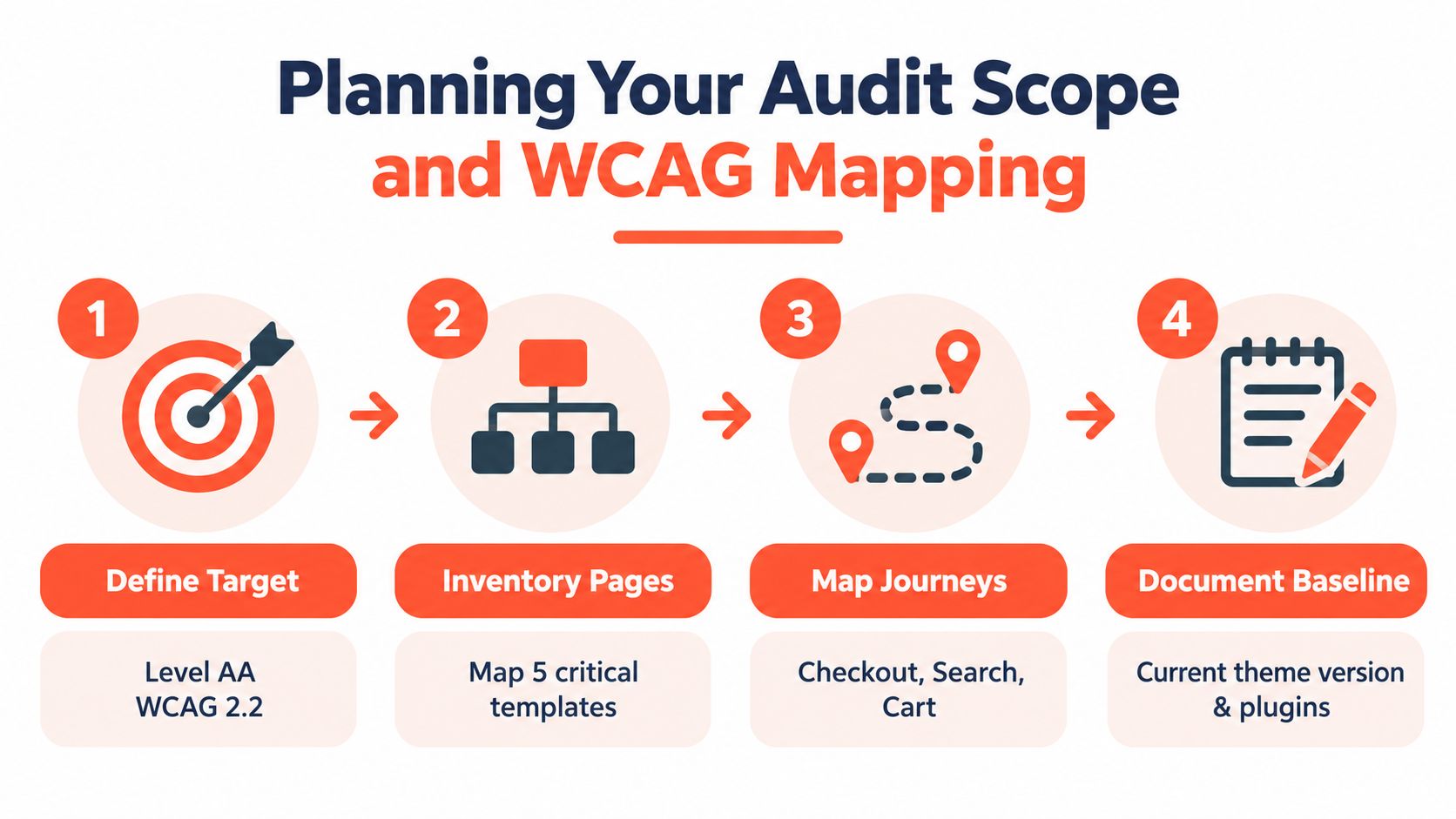
Start with a written scope before opening a testing tool. Decide whether the team is targeting WCAG 2.2 Level AA as the internal benchmark, while recognizing that the applicable legal standard may differ by organization and jurisdiction. The scope should identify the storefront, customer journeys, templates, third-party components, and release states that testers will evaluate.
Build the inventory around buying tasks
A page inventory is more useful when it reflects how customers shop. Include the homepage and navigation, but don't stop there. Record representative examples of:
Product detail pages: Test media galleries, variant selectors, quantity controls, accordions, reviews, subscription choices, and add-to-cart feedback.
Collection and search views: Include filters, sorting, pagination, autocomplete, empty states, and no-results messaging.
Cart interfaces: Test both the full cart page and any cart drawer, including quantity changes, removal controls, discount fields, shipping estimates, and live updates.
Checkout and account flows: Cover contact information, delivery, payment, authentication, order review, confirmation, and error recovery.
Content and support pages: Include forms, policies, returns information, promotional landing pages, video, and downloadable documents where they affect a purchase decision.
Record dynamic states, not just URLs. A modal after adding to cart, a closed and expanded filter panel, a disabled purchase button, an error message, and a loading state can all expose different accessibility behavior.
Create a simple WCAG traceability matrix
Map each test to a WCAG principle and success criterion, then add the component, journey, observed behavior, severity, evidence, owner, and retest method. This prevents a report from becoming a disconnected list of scanner warnings.
For example, a product variant control might map to keyboard operability, name, role, value, and status messages. The finding should say what happens when a keyboard user changes the variant, what a screen reader announces, and whether the price or availability update is communicated.
Teams that need a plain-language overview of the underlying obligations can use Presidio's guide to ADA accessibility requirements alongside the matrix. Keep the audit plan versioned with the Shopify theme, apps, checkout configuration, and relevant content so the baseline remains reproducible after changes.
Running Automated and Manual Testing Together
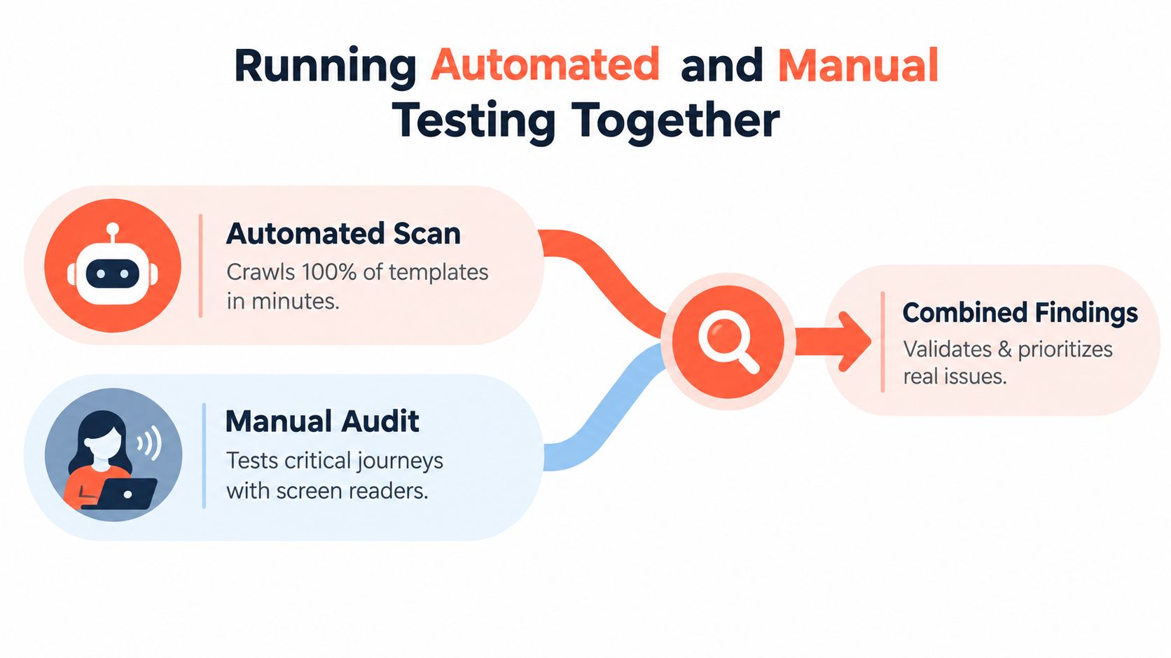
Automation and manual review answer different questions. A scanner can quickly identify repeated code patterns across templates, while a human tester determines whether a customer can complete a task with a keyboard or screen reader.
Industry guidance estimates that automated tools typically detect only about 30% to 57% of real WCAG issues, and the referenced large-scale WebAIM analysis found 96.3% of the top million homepages still had detectable WCAG failures despite widespread automated testing. The testing guidance supports a two-track workflow: scan broadly, then manually verify the journeys that matter.
What automation does well
Run a crawler or browser-based checker against representative templates and authenticated areas where access permits. Tools can help find missing labels, certain contrast failures, empty links and buttons, duplicate identifiers, invalid markup, and some ARIA problems. They're especially useful for spotting a shared issue in a theme section that appears across many product pages.
Use scan output for triage, not ranking by raw count. Deduplicate findings that originate from the same component, confirm whether the warning is valid, and connect each result to a journey. An empty button in a decorative carousel may matter less than a button with no accessible name that controls checkout shipping options.
What manual testing reveals
Begin each critical journey with the mouse unplugged. Use Tab, Shift plus Tab, Enter, Space, arrow keys, and Escape to verify that every control is reachable, the order makes sense, focus remains visible, and no component traps the user. Test opening and closing the menu, entering a search query, applying a filter, selecting a variant, adding an item, editing the cart, and submitting checkout fields.
Then repeat the same journey with a screen reader such as VoiceOver or NVDA. Listen for heading structure, landmark labels, accessible names, selected states, expanded states, validation errors, loading announcements, and cart changes. Zoom and reflow testing can expose clipped controls, overlapping content, and layouts that become unusable when text is enlarged.
Test state changes deliberately
Static page scans won't reliably evaluate:
Modals: Focus should move into the dialog, identify the dialog, and return to the triggering control after closure.
Drawers: Cart and filter drawers need an understandable label, keyboard access, a usable close control, and sensible focus behavior.
Hover and disabled states: Important information and actions shouldn't depend on hover alone or become indistinguishable when disabled.
Forms: Labels, instructions, required states, errors, and correction guidance must work together.
Live updates: Price changes, inventory notices, cart confirmations, and shipping messages need an accessible announcement strategy.
This combination is slower than installing a widget and accepting its score. It's also the only approach that tests whether a customer can complete the transaction rather than whether the markup contains a detectable pattern.
Common Accessibility Failures on Shopify Storefronts
Most Shopify findings aren't mysterious. They cluster around reusable theme components and app-injected interfaces. The practical mistake is treating every warning as equal instead of asking whether the defect blocks a shopping task.
Product discovery defects
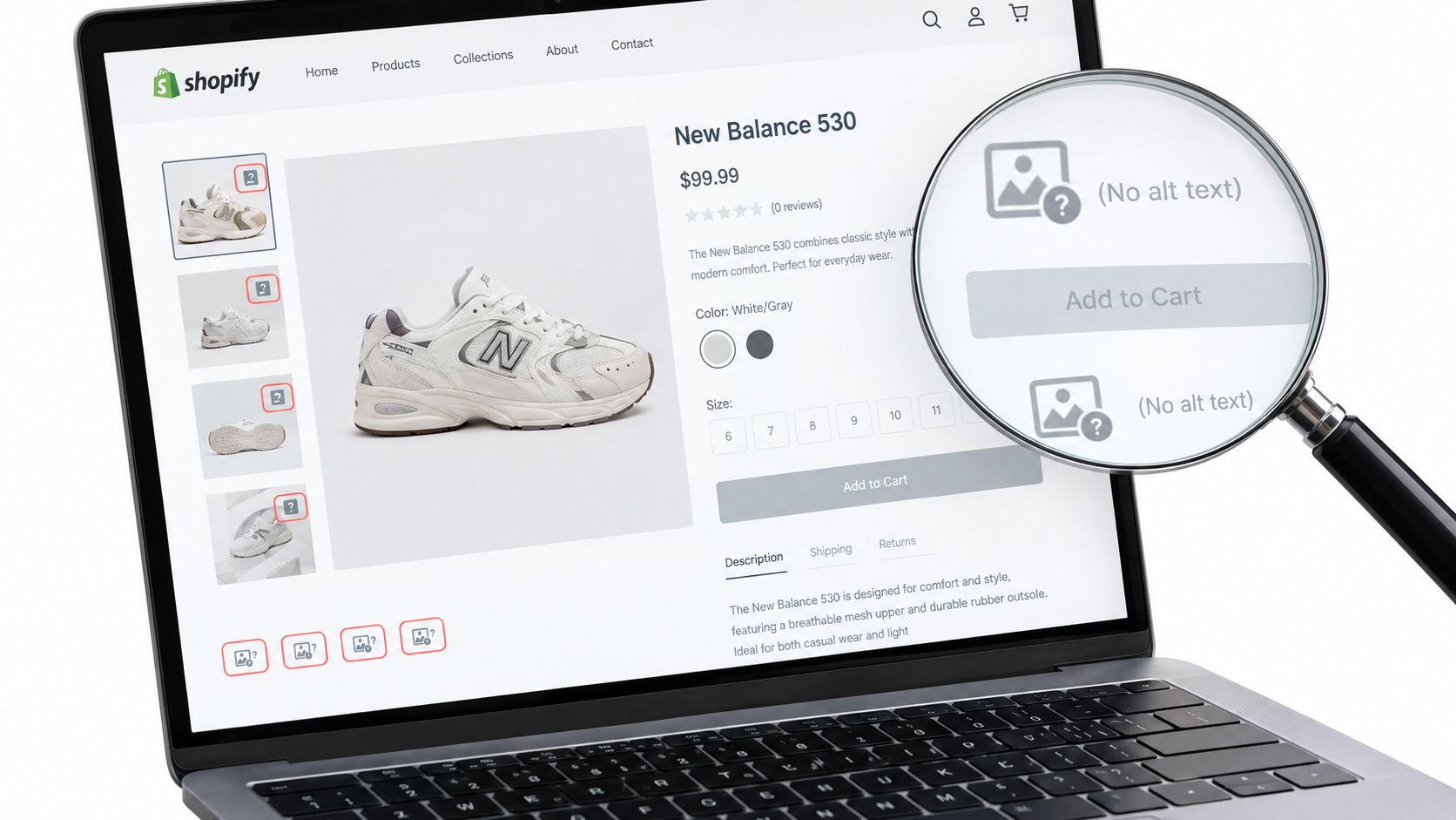
WebAIM's 2025 analysis found missing form labels on 48.2%, empty links on 45.4%, and empty buttons on 29.6% of the top million homepages. The WebAIM accessibility analysis gives those findings context, but a merchant still needs to inspect how each failure affects the storefront.
On Shopify, missing labels commonly appear in search fields, newsletter forms, quantity inputs, and app widgets. A placeholder isn't a dependable replacement for a persistent label because it can disappear during entry and may not expose the field's purpose clearly to assistive technology. Empty links and buttons often come from icon-only controls, image wrappers, carousel arrows, close buttons, or duplicated theme markup.
Alt text needs the same contextual judgment. A product image should communicate useful product information when the image carries meaning, while a decorative flourish should not add noise. For a practical explanation of writing useful descriptions, merchants can consult Silva Marketing's image optimization guide.
Cart and checkout blockers
The most serious failures often appear after the shopper clicks Add to cart. If a cart drawer opens without moving focus, a keyboard user may continue interacting with the page behind it. If the drawer closes without returning focus, the user can lose their place. If a quantity update changes the total without any audible or visual cue, the customer may not know whether the requested action worked.
Filters create similar problems. A filter button should expose its expanded state, the panel should be operable without a pointer, and applied filters should be understandable when a screen reader reviews the results. A checkout form needs associated labels, clear required-field treatment, useful error messages, and focus behavior that takes the customer to the problem instead of leaving them to search for it.
Shopify checkout customization has platform-specific limits and implementation choices. Teams working on that surface can reference Presidio's Shopify checkout customization guide, then validate the resulting experience with the same keyboard and screen reader journeys used for the storefront.
A page-level pass can coexist with a transaction-level failure. Test the action sequence, not just the template.
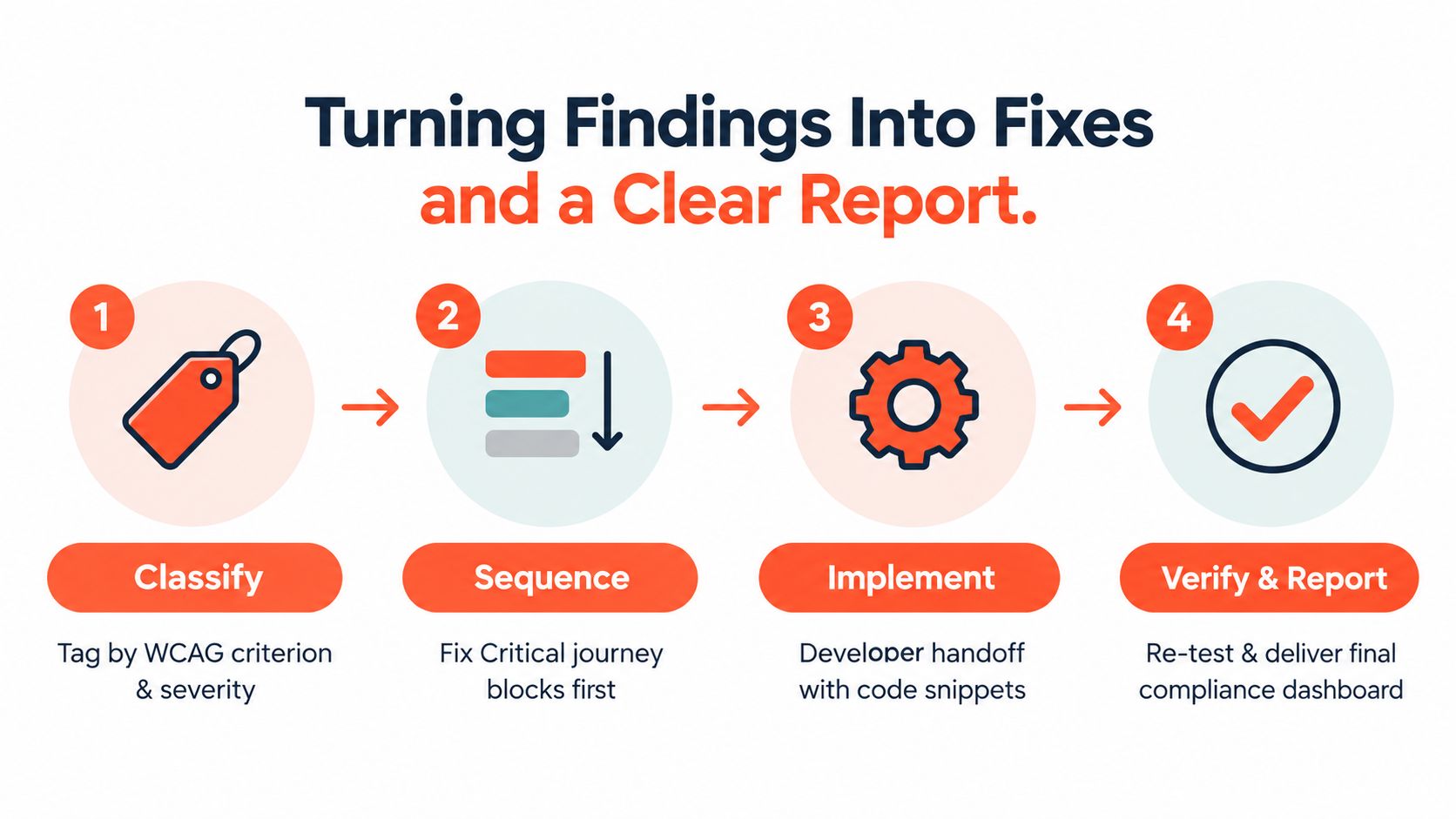
Turning Findings Into Fixes and a Clear Report
An audit report becomes useful when a developer can reproduce the problem without guessing. Every finding should connect the observed barrier to a WCAG criterion, affected component, customer journey, severity, evidence, recommended behavior, and retest condition.
Write tickets that describe behavior
A weak ticket says, “Fix accessibility on cart drawer.” A developer-ready ticket says which theme or app created the drawer, how to open it, what the keyboard user encounters, what a screen reader announces, and what should happen after the fix.
Use a structure like this:
Location: Identify the template, component, URL pattern, and relevant state.
Steps to reproduce: List the exact keyboard, pointer, or screen reader actions.
Observed behavior: Describe the barrier without interpreting beyond the evidence.
Expected behavior: State the accessible name, focus movement, announcement, or relationship the user needs.
WCAG mapping: Record the applicable success criterion and conformance level.
Priority: Mark the journey impact, recurrence across templates, and business criticality.
Retest: Name the browser, viewport, keyboard path, and assistive technology scenario that must pass.
A product-page issue that prevents variant selection should outrank a low-impact heading inconsistency on a blog article. A checkout error that can't be located or understood should outrank a cosmetic focus color adjustment, even though both may need attention.
Build a remediation queue
Classify defects by journey impact, not just technical severity. A useful order is:
Transaction blockers: Problems that prevent product selection, cart editing, checkout completion, login, or error recovery.
Repeated component defects: Failures in shared navigation, buttons, forms, dialogs, or theme sections.
Assistive technology communication gaps: Missing state changes, announcements, relationships, or instructions.
Content and presentation issues: Alt text quality, heading structure, contrast, link purpose, and reading order.
Lower-risk consistency work: Improvements that support usability but don't block a critical task.
Fix the source where possible. If the same unlabeled icon button appears through a Liquid snippet, correcting that snippet is more durable than patching individual pages. If an app injects the control, document the vendor dependency and decide whether to configure, replace, or wrap it with an accessible implementation.
For Shopify teams comparing a broad storefront review with a more focused operational assessment, a Shopify store audit from Presidio can help frame technical, UX, performance, and accessibility work in one backlog. Use any external service as part of an owned process, with internal owners responsible for implementation and validation.
Retest and close findings
A fix isn't complete when the warning disappears. Retest the original path, related states, responsive layouts, and other templates that share the component. Confirm that the change didn't create a new focus order problem, remove a label, or alter a live-region announcement.
Government monitoring provides a useful model for measurement. In the UK public-sector monitoring period, teams identified 26,171 issues, fixed 13,882, and left 3,693 unfixed, while observed compliance reached 70%, up from 59% in the prior period. The monitoring report shows why an audit program needs an issue register, ownership, retesting, and a defined 12-week closure window for unresolved items.
Keep evidence for each closed item. Store the original reproduction steps, the fix reference, retest result, date, environment, and any remaining limitation. That record gives stakeholders a more honest view than a single score and makes future regression analysis faster.
Keeping Your Store Accessible After the Audit
Accessibility work fails when the report sits outside the release process. Shopify stores change through theme edits, new products, landing pages, app installations, merchandising experiments, and checkout updates. Each change can reintroduce a defect or add a new interactive state that the original audit never covered.
The strongest maintenance model assigns responsibility to the people who create the change. Designers check focus, contrast, hierarchy, and component states. Developers use semantic HTML, correct labels, keyboard behavior, and accessible status updates. Content teams write meaningful alternative text, descriptive link labels, and headings that reflect the page structure.
Use a layered maintenance rhythm
Run lightweight automated checks against new templates and high-change areas, then schedule manual reviews for critical journeys after meaningful interface changes. A redesign, cart implementation change, search replacement, or new subscription flow deserves keyboard and screen reader testing even if the underlying URL already passed an earlier scan.
Keep an accessibility statement accurate and useful. It should explain the standard or benchmark used, known limitations, contact options, and how customers can request assistance. Don't publish a claim of complete compliance when the team hasn't verified the transaction paths that customers rely on.
A practical release checklist includes:
Theme changes: Review navigation, product templates, cart behavior, focus styles, and shared snippets.
App installations: Test every injected widget, modal, form, and notification in the journey where it appears.
Merchandising updates: Check new product media, variant data, promotional badges, and collection filters.
Checkout changes: Repeat the full path from contact information through confirmation, including an intentional validation error.
Regression tracking: Keep open findings visible, assign owners, record retests, and use the closure window established in the remediation plan.
The point of an ADA compliance website audit isn't to produce a reassuring snapshot. It's to create a repeatable way to find barriers before customers encounter them, especially at the moment they're ready to buy.
Presidio can audit Shopify and Shopify Plus storefronts using automated scans, keyboard review, screen reader testing, and human judgment, then support code-level remediation and retesting. Visit Presidio to discuss a transaction-focused accessibility roadmap for your store.

Jamie, Presidio’s Designer, leads the practice alongside Johnnie. With over 10 years of e-commerce experience, Jay is a Shopify expert, known for crafting innovative solutions that prevent tech debt.
Jaime
Senior Product Designer, 2020