Outrank AI

A shopper arrives at your Shopify store ready to buy. They can browse with a keyboard, but the product filters trap focus. They reach checkout, but the screen reader announces an unlabeled field with no useful instruction. The payment step may be visually obvious, yet the shopper can't tell which control is active or whether an error has been fixed. The product wasn't rejected. The buying journey became inaccessible.
That situation turns ADA accessibility requirements into more than a legal topic. Accessibility affects whether customers can perceive product information, operate storefront controls, understand checkout instructions, and complete a purchase independently. It also affects how your team designs themes, selects apps, reviews headless components, and tests changes before launch.
For Shopify brands, the practical question isn't only, “Is this page compliant?” It's, “Can a person with a disability complete the same shopping task through the same system?” That shift changes the work from patching isolated pages to improving reusable navigation, product cards, forms, modals, cart drawers, and checkout-adjacent experiences. A well-structured accessible store can also make browsing clearer for shoppers using mobile devices, zoom, captions, keyboard navigation, or simplified interfaces.
This guide starts with the legal relationship between the ADA and WCAG, then translates the four WCAG principles into storefront behavior. From there, it separates government obligations from private ecommerce risk, identifies the dynamic Shopify patterns that deserve priority, and outlines a repeatable implementation process.

A useful early design reference is this guide to organizing sections in Shopify, because reusable section architecture is also where teams can establish consistent headings, controls, spacing, and semantic patterns.
Table of Contents
Introduction to ADA Accessibility for Online Stores
Accessibility is part of the purchase experience
A storefront can look polished and still block a customer. A low-contrast sale badge may hide important information from a shopper with limited vision. A product video without captions excludes shoppers who can't hear the narration. A custom variant selector that works only with a mouse can prevent a keyboard user from choosing a size, color, or subscription option.
These barriers matter because ecommerce journeys are connected. If a customer can't identify a product option, open the cart, review an error, or submit a form, later improvements can't rescue the transaction. The defect may sit in one shared component, but its effect reaches every template that uses it.
Accessibility isn't a decorative layer added after the storefront is finished. It's part of the storefront's operating system.
What Shopify teams should measure
Compliance work becomes more useful when teams describe real tasks instead of collecting vague pass or fail labels. Ask whether a customer can:
Find products: Reach search, filters, menus, and collection controls without relying on a mouse.
Evaluate products: Understand images, videos, ingredients, dimensions, reviews, and available variants.
Configure an order: Operate swatches, quantity controls, subscription widgets, and accelerated payment choices.
Recover from errors: Hear or see what went wrong, identify the affected field, and correct it.
Complete checkout: Move through forms in a logical order with labels, instructions, and visible focus.
That task-based approach is especially important for stores using app-driven merchandising or headless architecture. A theme audit may cover the product template while missing a third-party quiz, a cart drawer, or a subscription selector that controls the actual conversion path.
The aim isn't to make accessibility a separate project that competes with growth. It's to make the buying path usable by more people, while giving designers and developers a reliable system for preventing the same defect from returning in another template or campaign landing page.
How ADA and WCAG Work Together
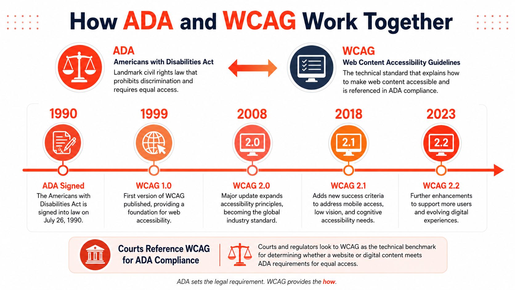
Think of the ADA as a building code and WCAG as the technical blueprint used to inspect the building. The ADA establishes civil-rights obligations and access expectations. WCAG translates digital access into testable guidance for content, structure, controls, and interactions.
The distinction matters because WCAG isn't the ADA itself. A court or regulator may use WCAG as a technical reference, while the legal question still depends on the applicable ADA title, the entity involved, the facts of the experience, and the relevant guidance or ruling.
The legal foundation
The modern U.S. framework for ADA accessibility requirements reached a foundational milestone on September 15, 2010, when the Department of Justice published revised regulations for Titles II and III and adopted the 2010 ADA Standards for Accessible Design. Those standards became enforceable on March 15, 2012, and apply to new construction and alterations involving public accommodations, commercial facilities, and state and local government facilities. The Department of Justice overview of the 2010 ADA Standards says the standards would affect more than 80,000 state and local governments and over 7 million businesses, helping make buildings and facilities accessible to more than 54 million Americans with disabilities.
That history explains why accessibility is treated as an enforceable minimum rather than an optional design preference. The 2010 Standards introduced both scoping rules, which describe what must be covered, and technical rules, which describe how covered elements should work.
The operational standard
For digital work, WCAG 2.1 Level AA gives teams a practical target. The DOJ's Title II web rule requires public entities' web content and mobile apps to conform to Level A and Level AA success criteria, unless compliance would create a fundamental alteration or undue burden, as described in the DOJ's web accessibility rule.
For a Shopify team, that means translating legal expectations into reusable implementation requirements:
Map the scope: Identify whether the site belongs to a public entity, a private business, or a partner delivering a public service.
Map the interface: Identify every template, component, form, embedded tool, and mobile surface involved in a customer task.
Map the tests: Check the relevant WCAG success criteria through automated scans, keyboard review, screen-reader testing, and human judgment.
Alternate versions are not the default solution. The DOJ permits conforming alternate versions only when direct accessibility isn't technically or legally possible. Fixing the source component is usually more durable than sending users to a separate accessible page that may omit the same products, promotions, or checkout functionality.
The relationship is simple enough to remember. The ADA supplies the legal context. WCAG supplies much of the technical vocabulary. Your Shopify implementation turns both into working customer journeys.
An introductory explanation can also help nontechnical stakeholders see how standards move into interface decisions:
The Four Principles Behind Every Accessible Experience
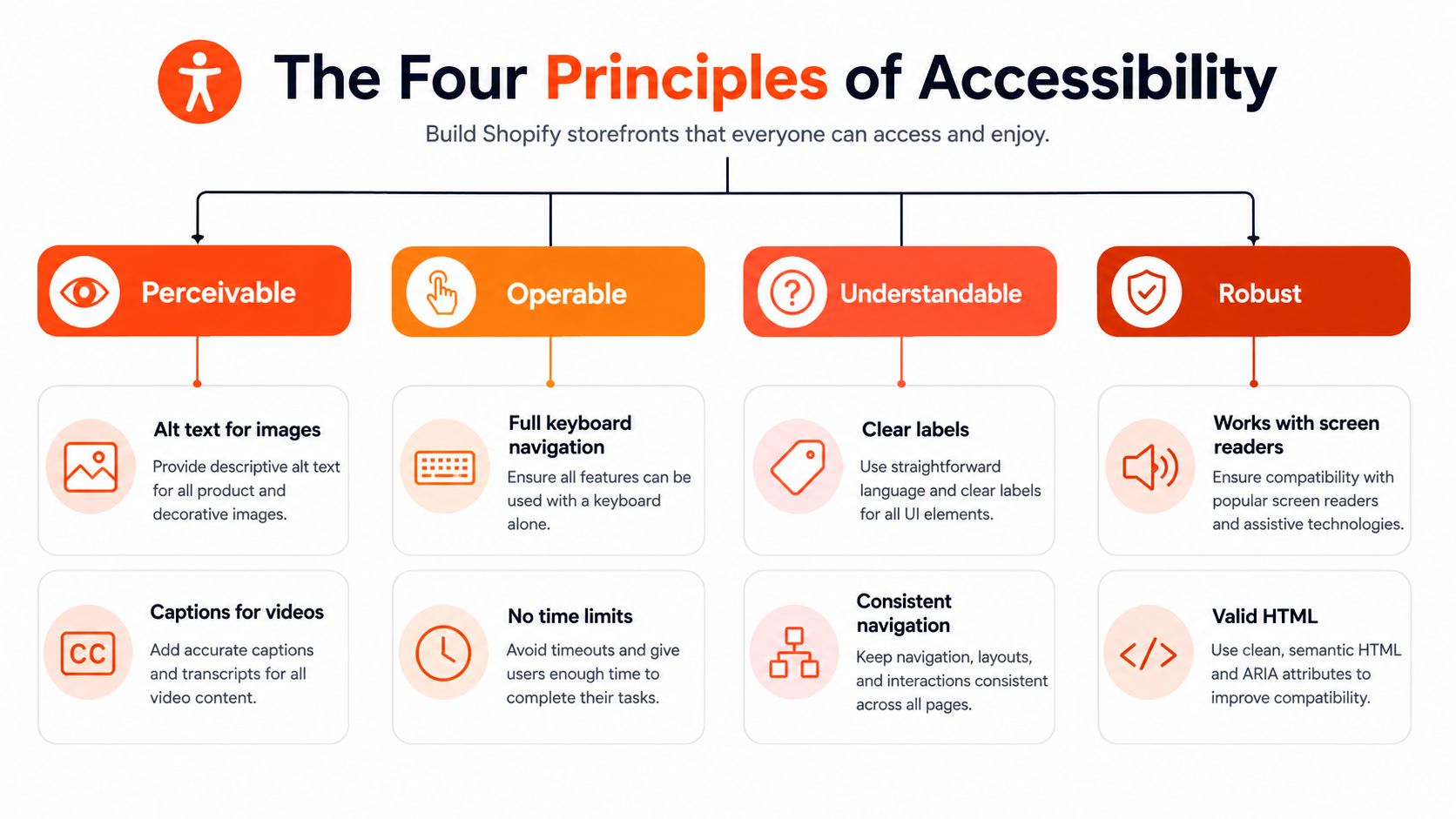
WCAG organizes accessibility around four principles: Perceivable, Operable, Understandable, and Compatible. This is the WCAG POUR framework. For a Shopify store, use the four principles as questions about each customer task, from product discovery through checkout.
Perceivable
Can the customer receive information in a format their senses and technology can use? A product image needs meaningful alternative text when it communicates product details. A demonstration video needs captions when spoken content matters. Text should remain readable when a customer increases its size or zooms the page, and color cannot carry meaning by itself.
On a Shopify product card, the product name, price, sale status, and available option should appear as text that assistive technology can interpret. A color swatch should not communicate “sage” through color alone. Give the swatch an accessible name, and expose its selected state programmatically.
Operable
Can the customer control the interface without a mouse, precise pointer movement, or a particular gesture? The W3C WCAG 2.1 specification covers keyboard access, focus behavior, and predictable interactions that apply to Shopify navigation, filters, menus, dialogs, and forms.
A cart drawer shows how a small component decision can disrupt a purchase. After a shopper activates “Add to cart,” the drawer may open visually while keyboard focus remains behind it. The next keypress can then affect the wrong part of the page. The close button also needs an accessible name, while sticky headers and promotional bars must not cover the visible focus indicator.
Understandable
Can the customer tell what the interface expects and what happened after an action? Clear labels, consistent navigation, useful instructions, and specific error messages give shoppers that information. A field labeled only “Input” does not say whether it requires an email address, apartment number, or discount code.
In Shopify checkout, a red border alone is not an adequate error message. Identify the affected field, explain the problem in text, preserve entered information where appropriate, and make the error discoverable through keyboard and assistive technology workflows. Treat the form like a conversation: each prompt should explain the next response, and each failure should show how to correct it.
Compatible with Assistive Technology
Will the experience continue to work with browsers, screen readers, zoom tools, and other assistive technologies? Semantic HTML, valid structure, predictable states, and restrained ARIA provide the foundation. A custom variant selector or quick-view dialog needs roles, names, values, and state changes that assistive technologies can interpret consistently.
The practical effects are direct:
Unlabeled product-grid controls make product discovery harder.
A variant component with missing state information can prevent configuration.
A modal with poor focus management can trap or disorient a shopper.
A form field without a label can stop checkout even when its visual design appears complete.
Accessibility defects are often system defects, not isolated copy errors. Repairing the reusable product card, form field, or dialog can improve many journeys at once. Fixing text on one product page leaves the underlying component available to fail again. A Shopify team should therefore prioritize shared theme components and checkout patterns, then verify their behavior across the dynamic states customers encounter.
What the Law Actually Requires for Ecommerce Today
The most common merchant misunderstanding is the assumption that a government deadline automatically gives every private Shopify store the same deadline. It doesn't.
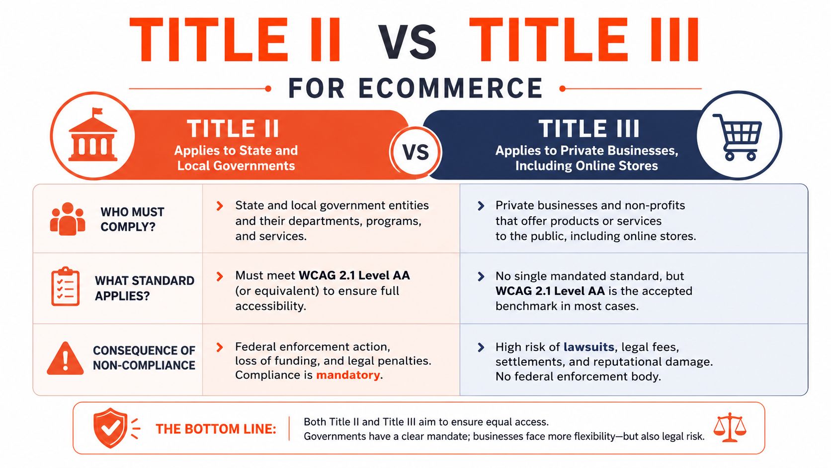
Title II and Title III answer different questions
Title II concerns state and local government entities. The DOJ's April 2024 web rule adopted WCAG 2.1 Level AA for covered government web content and mobile applications. The DOJ's more recent interim final rule delayed those government deadlines to April 26, 2027, and April 26, 2028, as described in the DOJ's current web accessibility rule resources.
That rule doesn't create a private-business deadline for Shopify merchants. A DTC brand generally needs to analyze its obligations and exposure under Title III, which applies to private places of public accommodation. The absence of one broad federal date doesn't mean the digital experience is risk-free. It means the compliance analysis is less straightforward than a calendar countdown.
Litigation changes the urgency
Recent filing data shows why teams shouldn't wait for a single private-sector deadline. One independent annual report counted 3,188 ADA website lawsuits in the United States in 2024, a decrease of 674 cases, or 17.46%, from 3,862 cases in 2023. Other tracking sources reported more than 4,000 digital-accessibility-related lawsuits in 2024, while federal-court reporting alone showed 2,452 website accessibility lawsuits. The 2024 federal-court filing analysis presents the changing totals and the continuing scale of the issue.
These figures aren't a prediction of what will happen to a particular store, and they don't establish that every inaccessible page violates the same legal rule. They do show that online accessibility has become a sustained compliance and litigation concern, especially for brands that rely on ecommerce as a primary customer channel.
Decision rule: Don't ask only, “What is the deadline?” Ask, “Which customer tasks are blocked, which components create the barrier, and what evidence shows that we're addressing them?”
A practical risk position
Private merchants should document their scope, accessibility objectives, known defects, remediation owners, and testing process. An accessibility statement can explain the brand's commitment and provide a path for feedback, but it can't substitute for fixing an inaccessible checkout.
This is risk management, not legal advice. A team facing a demand letter, complaint, or complex business structure should involve qualified counsel. A team not facing a complaint can still act now by prioritizing high-impact journeys and building accessibility into the theme and app review process.
Where Shopify Storefronts Most Often Fail Accessibility
Static content still matters, but dynamic commerce controls deserve earlier attention because they manage the transaction. A missing alt attribute on a decorative icon may create noise. A filter that can't be operated or a cart drawer that steals focus can stop the customer from reaching checkout.
Prioritize the reusable path
Use this matrix as a starting point for triage. “Priority” reflects likely journey impact and the effect available when a shared component is repaired. It isn't a legal risk rating.
Storefront Area | Common Barrier | Priority Level |
|---|---|---|
Search and autocomplete | Suggestions aren't announced, keyboard focus is unclear, or results can't be selected without a pointer | High |
Collection filters | Checkbox state, expanded sections, or result updates aren't exposed to assistive technology | High |
Product options | Swatches and variant buttons lack names, selected states, or usable focus styling | High |
Add-to-cart behavior | Status updates aren't announced, focus moves unexpectedly, or the cart drawer can't be closed | High |
Cart drawer and mini-cart | Dialog semantics are missing, focus isn't contained, or quantity controls are unlabeled | High |
Checkout-adjacent forms | Labels, instructions, errors, and required states aren't programmatically connected | High |
Subscription widgets | Frequency, price, and selected plan aren't conveyed clearly or operably | High |
Promotional modals | Focus enters behind the modal, close controls are unclear, or the modal appears without context | Medium to high |
Sticky headers and overlays | Fixed elements cover focused controls or reduce the usable viewport after zoom | Medium |
Product media | Images lack useful alternatives, video lacks captions, or carousel controls are inaccessible | Medium |
Editorial content | Heading hierarchy is confusing, links lack context, or text contrast is weak | Medium |
Decorative elements | Noninformative icons receive focus or clutter the screen-reader reading order | Lower, unless they affect navigation |
Third-party apps complicate the picture. An app may inject markup, event handlers, iframes, or modal behavior that your theme team doesn't control directly. Treat each app as part of the customer journey, not as an external excuse. Review its keyboard behavior, labels, focus order, mobile layout, and vendor accessibility documentation before adding it to a critical path.
Headless builds add another layer. React or another framework can produce clean visual interfaces while still leaving state changes, route transitions, loading messages, and custom controls unavailable to assistive technology. Test the rendered experience, not only the component source.
A good sequence is to fix shared primitives first, then flows, then content exceptions. Repairing one button, input, dialog, or product-option pattern can remove barriers across collection, product, cart, and promotional experiences. Page-by-page patching should come later, after the architecture stops reproducing the same failure.
Implementing Accessible Shopify Themes and Checkout Flows
Accessibility becomes maintainable when the team treats it as a build constraint, similar to responsive behavior or performance budgets.
Start with primitives
Begin with the small components that appear everywhere:
Buttons and links: Use the correct native element, provide an accessible name, preserve a visible focus state, and make disabled or loading states understandable.
Inputs: Associate every field with a label, connect help text and errors, expose required status, and keep the focus order logical.
Navigation: Build menus that work by keyboard, expose expanded and collapsed state, and don't move focus unexpectedly.
Dialogs and drawers: Move focus into the active surface, provide a named title, offer a clear close control, and return focus to the triggering element.
Media: Supply meaningful alternative text, captions, transcripts, or an intentionally empty alternative for purely decorative content.
Semantic HTML should carry as much meaning as possible. ARIA can fill gaps for custom behavior, but it shouldn't mask a native element that already provides better browser and assistive technology support.
For teams refining their markup approach, HTML mapping best practices for 2026 offers useful context on connecting interface structure to meaningful content relationships. That kind of mapping helps designers, developers, and QA reviewers use the same vocabulary for headings, controls, regions, and content hierarchy.

Build testing into delivery
A practical workflow looks like this:
Audit the current theme: Combine automated checks with manual review of priority journeys. Automated tools can flag missing labels or contrast concerns, but they won't reliably judge every focus transition or whether an error message makes sense.
Design shared primitives: Fix buttons, inputs, menus, product cards, option selectors, cart controls, and dialogs before editing isolated templates.
Implement semantic behavior: Use correct HTML, deliberate focus management, text alternatives, captions, and programmatic relationships.
Test complete tasks: Use only a keyboard, then test with screen readers and zoom. Review desktop and mobile surfaces, including app-injected content.
Monitor after launch: Recheck after theme changes, app installations, campaigns, checkout updates, and merchandising experiments.
Checkout customization needs special care because a visually successful extension can still produce an inaccessible form or status update. Teams working on Shopify checkout extensibility should include accessibility acceptance criteria alongside functional requirements, especially for validation messages, custom fields, payment-adjacent content, and focus behavior.
Lean implementation also reduces the number of unknown interfaces your team must govern. Presidio provides Shopify development, technical audits, performance work, and ADA accessibility improvements among its ecommerce services, which can be relevant when a brand needs theme remediation alongside broader platform maintenance.
Your Roadmap to Ongoing ADA Compliance and Better Conversion
An accessible Shopify store needs an operating rhythm, not a one-time scan. Start with a written scope, an inventory of customer journeys, and a prioritized issue register. Record the affected component, the user impact, the responsible owner, the test method, and the release where the fix will be verified.
Keep the work focused on journeys:
Browse: Menus, search, filters, collection cards, and pagination.
Choose: Product media, options, quantity, subscriptions, reviews, and merchandising widgets.
Buy: Cart, forms, checkout-adjacent extensions, payment instructions, and confirmation.
Return: Account areas, order information, support forms, and subscription management.
An accessibility statement can make feedback easier to find, but it should describe an active remediation process rather than claim perfection. Give customer support a clear escalation route so reports reach the team that can reproduce and fix them. Review vendors and apps before they become embedded in high-value flows.
Accessibility work also belongs in your broader Shopify conversion rate optimization program. The same improvements that help a screen-reader user understand a form can help any shopper recover from an error. Clear labels, visible focus, logical hierarchy, readable content, stable layouts, and predictable controls reduce friction across devices and contexts.
The next practical move is a technical audit of the theme and the complete purchase path. Fix the shared components first, verify the changes with people and tools, then keep accessibility in the definition of done for every new app, template, promotion, and checkout change.
Presidio can audit Shopify and Shopify Plus storefronts, remediate themes and accessibility barriers, and support ongoing development across checkout, apps, performance, and conversion work. Visit Presidio to discuss a practical accessibility roadmap for your store and its highest-priority customer journeys.

Jamie, Presidio’s Designer, leads the practice alongside Johnnie. With over 10 years of e-commerce experience, Jay is a Shopify expert, known for crafting innovative solutions that prevent tech debt.
Jaime
Senior Product Designer, 2020