Outrank AI

You've added a new product, opened the theme editor, and discovered that the page isn't a single canvas. It's assembled from configurable pieces called sections, each with its own settings, blocks, and placement rules. The immediate temptation is to add another section for every visual variation, but that approach can make a theme difficult to manage long before the storefront looks obviously complex.
Understanding sections in Shopify gives merchants control without constant code changes and gives developers a framework for building reusable theme features. The important distinction is that a section isn't merely a chunk of Liquid. It's a contract between theme code and the editor. It defines what a merchant can change, where the content can appear, and how much flexibility the theme should expose.
This guide treats sections as a working reference. It covers their history, the relationship between templates and blocks, the major section types, Liquid file anatomy, JSON schema, practical patterns, and governance decisions for growing stores. If you're planning a custom build or need help deciding how much of the theme should be configurable, Wistec Shopify development expertise provides useful context for evaluating a maintainable implementation.
Table of Contents
Introduction to Sections in Shopify and How They Power Your Store
Evolution of Shopify Sections From Unite 2016 to Online Store 2.0
Core Concepts Behind Shopify Sections and Blocks Architecture
Quick Reference for Section Limits Governance and Best Practices
Introduction to Sections in Shopify and How They Power Your Store
A Shopify storefront is assembled from configurable pieces called sections, each with its own settings, blocks, and placement rules. Before sections became central to theme editing, developers commonly placed content directly in fixed templates. A merchant who wanted a different layout might then need a code change or a separate theme copy.
Sections changed that working model by turning page features into reusable modules. Merchants can add, remove, reorder, and configure these modules through the theme editor, while developers keep the rendering logic in the theme code.
The practical workflow is:
Open Online Store > Themes > Edit theme.
Choose a page or template context.
Add, remove, or reorder sections.
Open a section to edit its settings and blocks.
Preview the result across supported storefront views before publishing.
Shopify's official documentation describes sections and blocks as editable elements in the theme editor, including rearranging sections and editing blocks in desktop and mobile workflows through Shopify's sections and blocks documentation. A merchant can therefore update a hero image, featured collection, promotional message, or content group without asking a developer to duplicate the theme for each change.
The problem sections solve
A section separates presentation structure from the content entered by the merchant. For example, a sections/featured-collection.liquid file can contain the Liquid needed to display products, while its schema lets the merchant select a collection, heading, product count, image treatment, and layout. The same implementation can appear in different templates without copying its code.
This separation also gives developers a controlled way to support future changes. A reusable promotional section can expose editable text, imagery, links, colors, and blocks instead of hardcoding one campaign into templates/index.json. The merchant controls campaign content, while the theme preserves its design system.
Practical rule: Make a setting editable when merchants are likely to change it, but do not expose every implementation detail as a setting.
A section functions as a contract between theme code and the editor. Its schema defines what a merchant can change, where the content can appear, and how much flexibility the theme should expose. That boundary matters when deciding whether a requirement belongs in a section setting, a repeatable block, or a metafield.
A useful mental model
A Shopify theme has several connected layers:
Templates define the arrangement for a page type.
Sections provide reusable content modules.
Blocks provide repeatable items inside a section.
Schema defines the controls shown in the editor.
Section groups organize related sections such as a header or footer.
This reference uses that model for practical decisions, including reusable patterns and governance around section limits. Merchants can focus on placement and editing, while developers can use clear file paths and schema context to keep the editor flexible without turning it into an unstructured page builder. For a custom build, Wistec Shopify development expertise can provide context for evaluating a maintainable implementation.
Evolution of Shopify Sections From Unite 2016 to Online Store 2.0
Shopify first announced sections for developers at Unite 2016, introducing a way to make homepage content more modular. At that stage, the main benefit was homepage customization. Developers could create configurable components, and merchants could manage those components in the editor rather than editing template code directly.
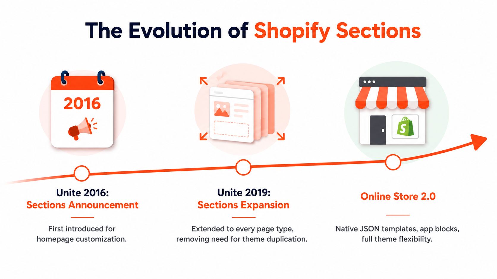
The model expanded at Unite 2019. Shopify moved from homepage-only editing to sections-based editing across every page type, allowing merchants to define reusable content and apply changes across multiple pages by editing a master page. Shopify's account of this development explains that the change removed the need to duplicate themes for content updates because content no longer had to be stored inside themes. The milestone represented a significant shift in Shopify's theme architecture, as documented in Shopify's history of theme sections.
Why older tutorials can be misleading
Older tutorials often show a homepage-centric structure. They may describe a section as something that belongs in templates/index.liquid, or they may assume that a merchant can rearrange content only on the storefront homepage. That advice reflects an earlier theme model and shouldn't automatically be applied to a modern Online Store 2.0 theme.
Modern themes commonly use JSON templates to describe which sections belong to a page and how those sections are configured. The template stores section instances and their settings, while the section file stores the reusable Liquid and schema implementation. This distinction lets the same section file serve different templates with different content.
The architecture milestone
The important change wasn't just the addition of a drag-and-drop interface. Shopify separated the reusable implementation from the page-specific configuration. A developer can maintain one section file, while the theme editor can save different settings for a product template, collection template, or custom page template.
That separation supports practical workflows such as:
Creating a product template with a merchandising section for one product group.
Reusing the same promotional section on a collection page.
Applying a shared header arrangement through a section group.
Updating content without creating a separate theme copy for every campaign.
The result is a theme architecture that can support merchant-led publishing while retaining developer-defined structure. Developers still decide what the section can do. Merchants decide how the available options should be used within the storefront.
Core Concepts Behind Shopify Sections and Blocks Architecture
Shopify themes follow a clear hierarchy: templates define page arrangement, sections provide configurable modules, blocks provide repeatable items within sections, and section groups organize related sections. JSON configuration records which modules belong to a page context and how each instance is configured.
A section is a Liquid file stored in the theme's sections directory. It combines reusable markup with a schema that exposes selected controls in the theme editor. Sections can contain blocks, allowing a merchant to add, remove, and reorder repeated items without changing the section's Liquid file. The Shopify theme sections architecture reference describes three rendering paths: JSON templates or section groups, static rendering with the section tag, and the Section Rendering API.

The hierarchy in practice
A product page might use templates/product.json. That template can reference a product information section, a recommendations section, and a rich content section. The product information section could contain blocks for a title, price, variant picker, quantity selector, and buy buttons.
A block normally depends on its parent section. The section determines where the block appears, which block types are permitted, and how section-level settings such as layout, spacing, alignment, or color scheme affect its markup. A block therefore represents a repeatable item inside a module, rather than a complete page-level feature.
Section groups manage shared storefront regions. A file such as sections/header-group.json can organize header-related sections, while a footer group can contain footer navigation, newsletter signup, and other persistent content. This structure gives developers a controlled way to maintain regions that recur across templates.
Three ways to render a section
JSON templates and section groups support flexible placement. The editor can add and rearrange eligible sections, while the saved JSON records each section instance and its settings.
Static rendering uses Liquid syntax such as:
Use this method when a section belongs in a fixed location and should not be freely moved by the merchant. The template establishes a predictable relationship with the rendered section.
The Section Rendering API returns rendered section markup for targeted updates. A cart drawer, filtering interface, or predictive search component can request a specific section after an interaction, avoiding a full-page reload when the theme supports that pattern.
Section design also requires governance. Keep a page's section count within Shopify's 25-section limit, and reserve sections for meaningful page-level modules. Use blocks for repeated content within one module, and use metafields when the content belongs to a product, collection, or other resource and should be reused wherever that resource appears. A reusable section with focused settings is easier to maintain than separate copies for every campaign, while a block should remain small enough for merchants to understand and arrange in the editor.
Types of Sections in Shopify and When to Use Each
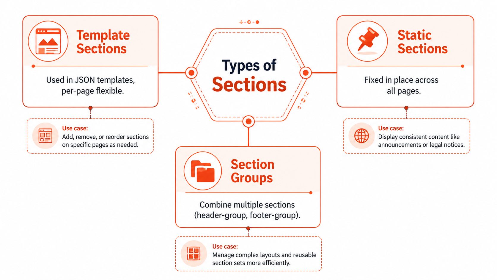
Shopify section types differ mainly by where they can be placed and who controls that placement. A flexible marketing module belongs in a JSON template. A structural element that must remain in a fixed location may need static rendering. A shared region such as the header benefits from a section group, while third-party functionality may be delivered through an app block.
Template sections
Template sections are designed for flexible placement in JSON templates. Common examples include:
Hero sections: Use for headline, image, button, and promotional content at the top of a page.
Featured collection sections: Use when the merchant should choose a collection and control how its products appear.
Rich text sections: Use for editorial content, brand statements, and supporting information.
Product information sections: Use for product-specific content and purchase controls, often with blocks for individual features.
A template section should expose settings that support a clear page goal. If a section combines unrelated features, merchants may struggle to understand which controls belong together.
Static sections
A static section is rendered in a fixed position by Liquid. This is appropriate for a component that depends on the template's structure or must always appear in a known location. A developer might statically render a product purchase form within a carefully controlled layout, or place a required content element beside a fixed data source.
Static rendering reduces placement flexibility, but that can be a benefit. Structural elements shouldn't always be draggable. If moving a section could break the intended hierarchy or styling, fixed placement provides stronger governance.
Section groups
Section groups collect multiple sections into a logical region. Header and footer groups are common examples because they can contain several independently configurable pieces while remaining associated with a shared site region.
A group can simplify the editor. Instead of treating every persistent element as part of an undifferentiated list, the theme can organize them around their role. It also gives developers a place to establish shared layout behavior for the group.
App blocks
App blocks let compatible apps contribute functionality inside a section that supports app block rendering. This is usually preferable to hardcoding an app's markup into a custom theme section because the merchant can manage the app-provided content through the theme editor while the theme preserves its own structure.
The choice becomes clearer with a simple question:
Storefront need | Suitable approach |
|---|---|
Merchant-controlled marketing module | Template section |
Fixed structural component | Static section |
Shared header or footer region | Section group |
Third-party feature inside a supported area | App block |
Merchants who need broader implementation context can use this complete Shopify development guide alongside the official theme documentation. The key is to choose the least complex primitive that supports the intended editing workflow.
Anatomy of a Shopify Section File Structure and Liquid
A Shopify section file normally lives in the sections directory and combines three concerns:
Liquid markup for storefront output.
Optional CSS or JavaScript hooks for behavior and styling.
A
{% schema %}object that defines editor settings, blocks, and presets.
A simple file might be named sections/promo-banner.liquid. The filename is part of the theme's internal vocabulary, so use names that describe the section's purpose rather than its current campaign. promo-banner.liquid is more reusable than summer-sale-banner.liquid.
A lean section skeleton
The section.settings object reads values defined in the schema. A preset makes the section available through an add-section flow with an initial configuration. Conditional checks such as if ... != blank prevent empty headings, links, or buttons from producing awkward markup.
Rendering context and maintainability
A JSON template can reference the section dynamically, while a Liquid template can render it statically with the section tag. The same file can therefore serve different placement strategies, provided its assumptions match the rendering context. Avoid embedding page-specific business rules in a general-purpose section, because that makes reuse harder and encourages duplicate files.
Keep CSS selectors scoped to the component, and use predictable naming such as promo-banner and promo-banner__text. If JavaScript is needed, attach behavior to stable data attributes rather than depending on incidental DOM order. For a broader view of maintainable custom implementations, see this guide to custom Shopify theme development.
Understanding JSON Schema Settings Presets and Blocks
The schema is the editable contract for a section. It tells Shopify which controls to display, what values to store, which blocks the merchant can add, and whether the section should appear as an option in the editor. A well-designed schema gives merchants useful control without exposing settings that could undermine the component's layout.
Common setting types
Setting Type | Purpose | Example Use |
|---|---|---|
| Short plain text | Button label or eyebrow |
| Formatted editorial content | Supporting copy under a heading |
| Select a theme image | Hero or promotional artwork |
| Choose a numeric value within a defined interval | Content width or spacing |
| Choose from predefined options | Text alignment or layout mode |
| Select or enter a destination | Button or linked image |
| Toggle a behavior | Show or hide a secondary element |
A setting should have a clear label and, where appropriate, a safe default. A range setting needs sensible boundaries and a step value so merchants can make controlled adjustments. A select setting is preferable when only a small set of design-system options should be valid.
Blocks create repeatable content
A section can define block types for repeatable elements. A testimonial section might allow quote, author, and image blocks, while a feature grid might allow an icon, heading, and text block. The Liquid markup then loops over section.blocks:
The block.shopify_attributes output helps the editor identify and manage the block in the visual interface. Block-specific settings belong inside the block definition, while settings that affect the entire layout belong at section level.
Presets and defaults
Presets answer a practical question: what should a merchant see immediately after adding this section? A preset can provide a useful initial layout and prepopulate blocks. The default should demonstrate the component without forcing the merchant to remove irrelevant content.
Schema decisions also affect governance. A section with many independent settings may become difficult to scan, while a section with no meaningful controls forces code edits for routine content changes. Developers should group settings logically, use descriptive labels, and avoid adding a new control merely because it's technically possible.
For more detail on balancing editor flexibility with theme structure, consult this guide to Shopify theme customization. The best schema is not the longest one. It's the one that exposes the decisions merchants need to make.
Practical Examples of Shopify Sections in Action
The difference between a usable section and a fragile one becomes clearer through patterns. Each example below starts with a page goal, then identifies the section boundary, block model, and editor behavior that support it.
Hero section with controlled blocks
A hero section usually needs a heading, supporting text, image, primary link, and optional secondary link. The section should own layout settings such as alignment and content position, while buttons can be represented as blocks if the design supports a variable number of calls to action.
This pattern works well when the merchant needs to change campaign content without changing the page structure. Keep the block types narrow. A button block shouldn't also contain unrelated product-card settings.
Featured product grid
A featured product grid can use a collection setting, then render products from that selected collection. Its schema may expose heading, product count, column style, and a link to the full collection. The collection itself remains data, while the section controls presentation.
This is a good template section because the same component can appear on a homepage, landing page, or collection-related template. If a brand needs different merchandising logic for different contexts, an alternate template may be clearer than adding many conditional settings to one section.
Testimonial content
Testimonials are naturally block-based. Each block can include a quote, author name, role, image, and optional link. The section can control the overall layout, while the blocks provide the repeated records.
A simple list may be more maintainable than a slider when the content doesn't require interaction. If a carousel is necessary, the developer should provide accessible controls, meaningful focus behavior, and a layout that remains readable when JavaScript isn't available. The block model should support the content first, not dictate a visual effect.
Announcement bar
An announcement bar can be a small section or part of a header group. Its settings may include message, link, visibility toggle, and color scheme. If multiple messages are required, blocks can represent individual announcements, but the section should define how they rotate or stack.
Build the editor experience around the merchant's publishing task, not around the internal component tree.
For every example, test the section in the actual editor. Confirm that the preset is understandable, empty states don't leave broken spacing, long text doesn't damage the layout, and mobile behavior remains intentional. The editor is part of the product, not merely a configuration screen for developers.
Quick Reference for Section Limits Governance and Best Practices
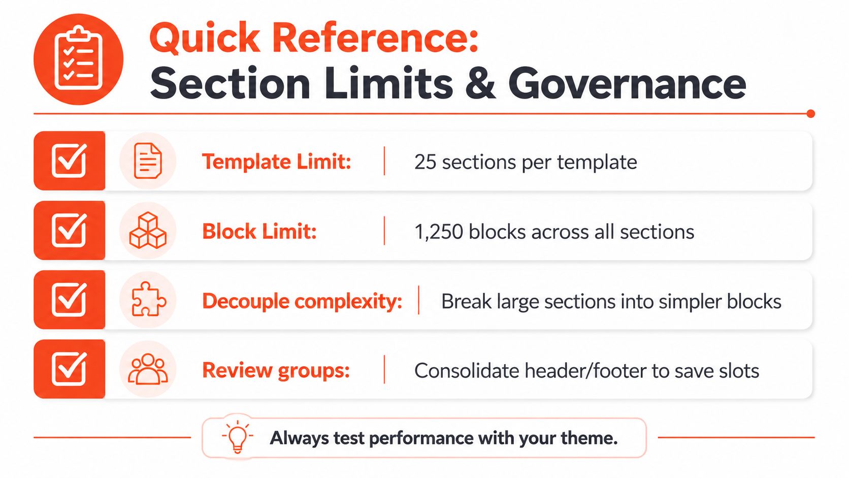
Shopify documents a limit of 25 sections per template and 1,250 blocks across all sections in that template. These limits are documented in Shopify's theme editor guidance, and they make architecture a governance concern rather than a purely visual one.
Decide whether you need a new section
Use a new section when the content has a distinct layout, reusable purpose, and meaningful configuration boundary. Use a block when the item repeats inside an existing layout. Use a metafield-driven pattern when the structure stays stable but the content varies by product, collection, or another resource.
An app block makes more sense when the functionality belongs to an installed app and should remain independently managed. An alternate template is often cleaner when an entire page type needs a different composition, rather than a long list of conditional settings inside one template.
A useful review checklist includes:
Name by purpose: Use stable names such as
product-benefits.liquid, not temporary campaign names.Separate structure from content: Store reusable page content in appropriate data sources instead of cloning sections for every variation.
Control block growth: Add block types that represent real repeated content, not every possible visual variation.
Audit section groups: Keep shared header and footer regions organized so persistent elements remain discoverable.
Remove abandoned patterns: Delete unused sections and obsolete schema settings after a migration or redesign.
Test the editor: Confirm that presets, defaults, labels, and empty states make sense to a non-developer.
Keep the storefront maintainable
Section limits are only one part of governance. A theme can remain technically within those limits and still become difficult to operate if every section loads unnecessary assets, duplicates similar markup, or exposes confusing controls. Review CSS and JavaScript dependencies, defer behavior that isn't needed at first render, and test real content rather than placeholder text.
For a focused treatment of storefront speed and technical hygiene, use this resource on Shopify performance optimization. A maintainable theme gives merchants freedom within clear boundaries. That balance protects the editor experience, keeps templates understandable, and makes later development safer.
Architecture rule: Before adding a section, ask whether the request changes layout, repeats content, or only changes data. Those answers usually point to a section, block, or metafield respectively.
Presidio builds and supports custom Shopify themes, apps, and storefront systems, including maintainable section architectures for Shopify and Shopify Plus brands. If your theme has become difficult to edit or needs a clearer pattern for sections, blocks, metafields, and app integrations, visit Presidio to discuss a practical development or optimization plan.

Jamie, Presidio’s Designer, leads the practice alongside Johnnie. With over 10 years of e-commerce experience, Jay is a Shopify expert, known for crafting innovative solutions that prevent tech debt.
Jaime
Senior Product Designer, 2020