Outrank AI

You've got a theme that was fine at launch, then the significant work started. A freelancer added a quick product badge, marketing wanted a new landing page layout, an app injected its own markup, and suddenly the same spacing rule shows up in three different places with three different results. The team keeps shipping, but every new release feels like it's negotiating with the old ones.
That's where a Shopify design system stops being a design artifact and starts being an operating model. Shopify's own Polaris work shows that the system is meant to standardize merchant and admin interfaces, and its React component library now includes production patterns such as data visualizations and metrics cards in Shopify's Polaris React documentation. At Shopify's scale, where the platform has been reported at roughly 4.8 million to 6.97 million live stores by 2025 to 2026 and the company processed $292.3 billion in GMV in 2024 as summarized by industry trackers, the cost of drift isn't cosmetic. It's operational.
A design system only matters when it changes what teams are allowed to ship.

If your team manages multiple storefronts, this gets even messier. A useful way to think about the boundary problem is to compare how a single storefront behaves with how a portfolio behaves, which is why teams often start by mapping their surfaces and ownership models in guides like multiple storefronts on Shopify.
Table of Contents
The Real Problem a Shopify Design System Solves
A storefront usually does not break all at once. It starts with small inconsistencies, a product card hovers one way on the collection page, another way in the homepage grid, and a third way inside a promotional block. The mobile header changes after an app install, and the checkout pre-step feels like it belongs to a different store.
By the time a team notices the pattern, the issue is usually drift. Theme work has piled up across releases, agencies, freelancers, and app overlays, and each change has introduced a custom exception. The storefront still works, but it no longer feels governed.
The shift from files to a living system
A Shopify design system gives the team a shared way to decide what stays standard, what gets reused, and what gets built once instead of copied across templates. It also gives product, engineering, and marketing a place to resolve disagreements in a structured review, rather than in a Slack thread after launch.
That matters because Shopify's own theme guidance emphasizes resilient layouts, consistent typography and color systems, mobile-first performance, and testing with real users. Those are the same pressures that make the boundary question show up in real work, not only in design reviews. A system only pays off when it prevents the next release from reintroducing the same problems.
The real deliverable is not a Figma file. It is a set of rules that keeps the storefront coherent when nobody is watching.
The practical test is straightforward. After you apply this model, you should be able to decide whether a change belongs in the shared system, whether it should remain one-off, and who needs to approve either path. That is the difference between a storefront that compounds over time and one that keeps resetting itself, especially for teams managing multiple storefronts in Shopify.
What a Shopify Design System Contains
At the highest level, the structure is plain enough. A Shopify design system usually has three layers, tokens, components, and patterns. The trouble starts when teams treat those layers as interchangeable, then wonder why changes stop scaling cleanly.
Tokens, components, and patterns
Tokens are the raw values. Color, spacing, radius, typography, and motion sit here. These are the constants that let a brand feel distinct without forcing every section to be rebuilt by hand.
Components are the reusable UI pieces, buttons, inputs, cards, tabs, badges, and similar building blocks. They take token values and turn them into interface pieces shoppers can use consistently.
Patterns are the composed flows. A product card, a cart drawer, or a pre-checkout step is not only a component. It combines components with commerce logic, state, and constraints.
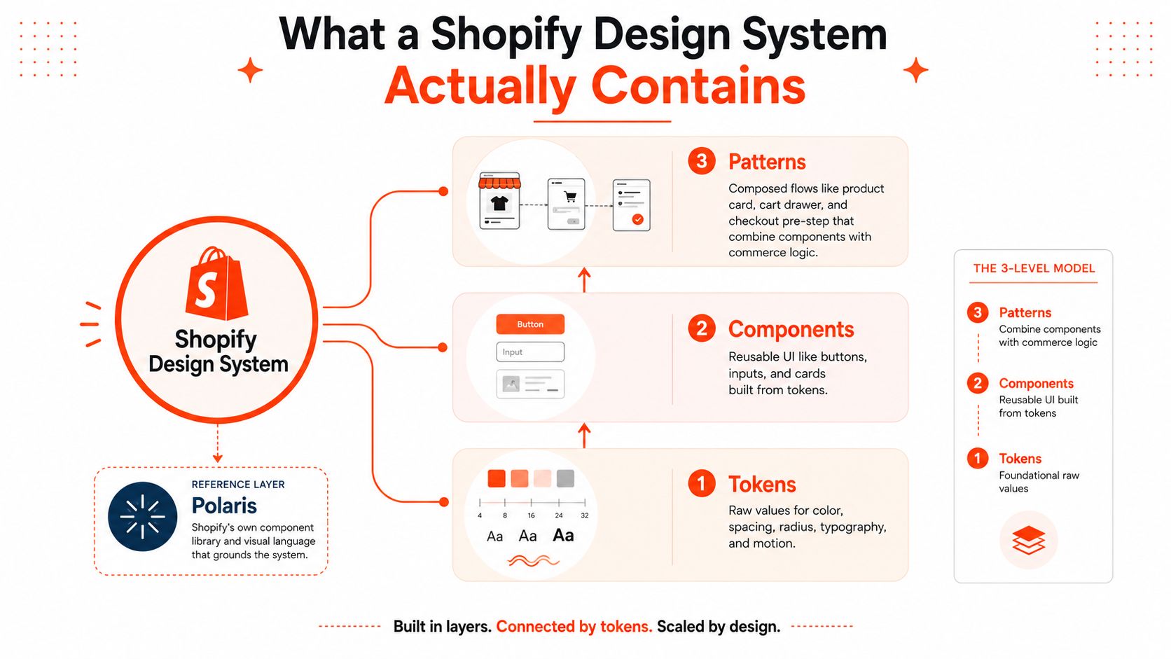
Polaris makes that hierarchy concrete. Shopify's documentation exposes Polaris React as a component library, which signals that the system is used as a production foundation, not only as a style guide in Shopify's Polaris React docs. For a Shopify team, that means the system is not just what the app looks like. It is how the app behaves at the level of reusable commerce UI.
The boundary matters as soon as a team builds a theme. A component library for merchant-facing admin surfaces does not automatically become a storefront kit, and that line gets blurry fast when teams copy “use Polaris” advice without checking the surface they are shipping to. For teams building custom storefronts, custom Shopify theme development is where this abstraction is translated into Liquid, CSS, and app logic.
The useful mental model is direct. Tokens define the brand system, components define the UI system, and patterns define the commerce system. If a change does not fit one of those categories, it probably is not a system-level change at all.
Design Tokens and the Theme Layer
Tokens are the layer many teams skip, and that is usually where the debt starts. If a section hardcodes #111111 for text, 24px for spacing, and a custom font size in one file, every future rebrand turns into a scavenger hunt. If those values come from a token source, the same visual change can be applied with far less code churn.
Why token-driven themes age better
In a Shopify theme, tokens can live in more than one place. They might appear in a Liquid settings schema, be exported into CSS custom properties, and feed a design file in Figma. That gives the team a stable structure even when the visual identity changes, which is the point of separating brand choices from template logic.
A storefront is a little like a building with utilities behind the walls. The wiring does not need to change every time the paint color changes. Tokens handle the repeating decisions, while sections and templates handle layout and behavior.
Accessibility also gets easier to reason about at this layer. Contrast checks are more reliable when they happen against the token palette, because that is where the actual color pairs are defined. If a text color and background color fail together, the fix belongs in the token set, not in one card or banner instance.
That is why teams that design inclusive websites with contrast tend to catch fewer surprises later. Contrast problems usually show up across the system, so patching only one failed component leaves the next instance exposed.
Hardcoded values versus reusable tokens
A hardcoded section is fast to ship and expensive to maintain. A token-driven section takes more setup up front and is much easier to retheme later. On Shopify, that trade-off matters because merchants expect themes to absorb brand changes without a full rebuild, and the Shopify theme customization work gets much cleaner when the team has already separated visual decisions from template code.
That separation is the boundary problem in practice. Color, spacing, typography, and radius belong in tokens when the team expects them to vary by brand or season. Behavior belongs in components when the interaction itself changes, such as validation states, disclosure patterns, or cart logic. If a change only alters appearance, pushing it into component code creates unnecessary drift and makes future swaps harder.
The broader market pressure reinforces that choice. The official Theme Store includes a wide range of merchant-facing themes, so shops inherit a lot of shared expectations about layout, contrast, and customization. Themes that keep those choices in tokens travel farther because merchants can adapt them without breaking the design language.
The clean rule is simple. Put brand decisions in tokens when you expect them to vary, and put them in components only when the behavior itself needs to change.
Polaris and How Storefronts Relate to It
A lot of Shopify teams get tripped up by Polaris because they expect it to solve storefront design the same way it solves admin UI. It doesn't. Polaris is Shopify's system for merchant and admin experiences, and its React-based references are built around product surfaces like data views, metrics, and internal workflows, not drop-in Liquid storefront sections as shown in Shopify's Polaris React documentation.
What Polaris gives, and what it doesn't
What Polaris gives a team is a shared vocabulary. It gives principles, accessibility guidance, and reusable references for product UI that has to work at Shopify scale. What it doesn't give is a ready-made storefront component library for Online Store themes.
That's where teams need to be precise. A merchant admin experience and a shopper storefront have different constraints. The admin side cares about information density, operational clarity, and consistency across workflows. The storefront cares about conversion, content hierarchy, app overlays, responsive behavior, and visual differentiation.
The bridge to storefront work
The bridge is not a one-to-one component transplant. It's a set of design principles that can be carried into theme work, plus the newer direction Shopify is signaling with Horizon in its Summer ’25 design announcement from Shopify News. Horizon matters because it shows the platform is still evolving, which means teams can't treat their current implementation as permanent.
That leaves a second bridge, custom apps or headless layers. If your brand builds a bespoke app surface or a custom storefront, you can align the UI with the same patterns the internal team uses, but you still have to adapt those patterns to the surface you own. That's where many teams overreach. They assume “Polaris-inspired” means “Polaris everywhere,” then discover that the implementation cost is higher than the value.
The simplest mental model is this. Polaris governs Shopify product surfaces, theme guidance governs storefront constraints, and your custom layer decides how much of that structure you preserve.
Patterns Storefront Teams Reuse Every Day
Once tokens and components are settled, patterns are where the system starts to feel real. These are the reusable commerce structures that keep the storefront from turning into a collection of one-off page hacks. The value isn't that every page looks identical. The value is that every page behaves predictably enough that teams can ship without rebuilding the basics.

Where reuse saves time
A product card usually combines image, title, price, badges, and action states. A collection grid repeats that card at scale, which is why spacing tokens and image rules matter so much there. A PDP layout pulls in galleries, variant selectors, reviews, delivery messaging, and the add-to-cart action, all of which need to hold together when content changes.
A cart drawer is another good example. It looks small, but it depends on state handling, accessibility, keyboard support, and predictable button hierarchy. A subscription widget or post-purchase upsell adds another layer of commerce logic, especially when apps are involved.
Here's the key boundary. The more a team rebuilds these as custom pages instead of patterns, the more they duplicate logic that should have stayed centralized. That's usually where theme debt appears first, because every exception has to survive future product launches.
Pattern | Default / Systemized | Common Reason to Customize |
|---|---|---|
Product card | Shared image, title, price, and action structure | A brand wants a unique promotional badge or layout |
Collection grid | Reusable grid rules and spacing tokens | Marketing wants a highly editorial collection landing page |
PDP layout | Standard blocks composed into one purchase flow | A launch campaign needs a custom storytelling sequence |
Cart drawer | Shared interaction pattern with stable actions | A team wants a more branded mini-cart experience |
A launch scenario makes the trade-off obvious. If a brand introduces a new product line, marketing usually wants a custom story, but engineering doesn't need to rebuild the whole purchase path. A systemized approach lets the launch use new content blocks and token changes while keeping the underlying commerce pattern intact.
When Extending the System Actually Hurts
More customization sounds like more freedom, but that's often the wrong metric. The better question is whether the change makes the storefront harder to maintain, harder to access, or harder to upgrade. Shopify's own theme guidance pushes teams toward resilient layouts, strong contrast, prominent navigation, and real testing with purchase scenarios, which is a good clue about where the line should be drawn.
Three places teams overfork
A heavy PDP customization can break responsive behavior fast. A bespoke card stack may look good in a design review, then collapse when content grows or when the viewport shrinks. That creates accessibility and layout debt immediately.
A custom cart drawer can be worse. If the interaction model ignores keyboard navigation or focus management, the brand has built a polished surface that's awkward or unusable for some shoppers. That's not a visual problem, it's a product problem.
Discount UIs cause a different kind of pain. If a team builds a one-off discount flow that doesn't align with the platform's rule model, the experience can conflict with more modern discount logic and create support work later. The interface becomes a special case that only one campaign understands.
A practical build versus extend rule
If the change alters the behavior of commerce, treat it like platform work. If it only changes the expression of the brand, keep it inside the system.
That rule isn't perfect, but it prevents the worst mistakes. A custom visual treatment may be worth it when it stays inside the established component and token model. A custom flow is worth it only when the business requirement can't be expressed otherwise.
If a change forces the team to rewrite responsive behavior, accessibility support, or upgrade paths, the system probably already told you the answer. The hard part is listening before the fork lands in production.
Governing the System Over Time
A design system breaks down when no one owns the line between shared and custom work. The fix is governance, not more documentation. In practice, that usually means a lead engineer and a design lead own the system together, with contribution rules that make it clear how a token, component, or pattern gets changed.
What ownership needs to look like
Versioning has to track the upstream direction too. Polaris changes, Horizon direction, and theme framework updates all need a place in the team's release process so the system doesn't drift away from Shopify itself. If the storefront depends on the platform, the system needs a standing review path for platform changes.
A healthy contribution flow usually looks boring, which is a good sign. Someone requests a change, the design system team reviews whether it belongs in tokens, components, or a pattern, the code lands through a pull request, and the Figma library gets updated at the same time. The communication layer can be an internal docs site, Storybook for app surfaces, and a theme changelog for Liquid-based work.
A system without an owner turns into a folder of unresolved opinions.
The governance checklist for a quarter is pretty concrete. You need an owner, a contribution rule, a versioning policy, a place to preview components, and a way to tell the rest of the team what changed. Without those pieces, every new request becomes an exception by default.
Bringing It Together for Your Storefront
The fastest way to make a good decision is to ask three questions. Is this a token, a component, or a pattern? Does something equivalent already exist in Polaris, in the theme, or in a nearby shared library? What happens when Shopify changes the platform surface this work depends on?
If you answer those questions, most “should we customize this?” debates get shorter. The team stops arguing from aesthetics and starts arguing from maintainability, accessibility, and upgrade cost. That's the primary benefit of a Shopify design system, not visual consistency for its own sake, but the speed to ship consistent commerce experiences without rebuilding the same logic over and over.
Horizon makes that discipline even more relevant, and so does the rise of AI-driven personalization inside Shopify. Generated experiences still need brand rules, interaction rules, and governance, or they'll become another source of drift. The competitive advantage isn't novelty. It's how quickly your team can ship experiences that stay coherent under pressure.
If your team needs help turning a brittle storefront into a governed system, Presidio works on Shopify theme customization, custom app development, and storefront redesigns that keep maintainability in view from the start. Visit Presidio if you want a practical build plan for tokens, components, and the boundaries between them.

Jamie, Presidio’s Designer, leads the practice alongside Johnnie. With over 10 years of e-commerce experience, Jay is a Shopify expert, known for crafting innovative solutions that prevent tech debt.
Jaime
Senior Product Designer, 2020