Outrank AI

Your product page looks polished, the imagery is strong, and the traffic is arriving. Then shoppers select a variant, scroll through the details, and hesitate because the add to cart button is hard to find, fails to confirm the action, or behaves differently on mobile. A small interaction problem at that moment can interrupt purchase intent before the cart ever gets a chance to do its job.
After shipping more than 150 Shopify storefronts, I treat the button as a conversion system, not a colored rectangle. Liquid markup, variant logic, AJAX behavior, loading states, accessibility, sticky positioning, and analytics all need to work together. If one layer breaks, changing the button color won't fix the underlying leak.
Table of Contents
How Shopify Renders the Add to Cart Button and How to Customize It
Tracking Testing and Optimizing Your Add to Cart Button for Growth
Why Your Add to Cart Button Decides Shopify Conversions
The add to cart button is the point where browsing becomes an observable purchase action. A shopper can read every product detail, compare variants, and spend several minutes on a product detail page, but the add-to-cart event is the clearest signal that interest has become intent.
The standard measurement is straightforward. Add-to-cart rate equals sessions with an add-to-cart event divided by total sessions, and recent benchmarks place the global average around 6.08% to 6.41% across 2024 and 2025, according to OpenSend's ecommerce add-to-cart rate statistics. In practical terms, roughly six of every 100 shopping sessions reach product selection, although category context matters considerably.
Beauty and personal care has reached about 9.46% at peak monthly levels, while luxury and jewelry has been as low as 1.76% in the same benchmark window, as reported by OpenSend's category benchmark analysis. Those differences aren't a universal scorecard. Price, consideration time, product familiarity, and buying urgency all affect how readily shoppers press the button.
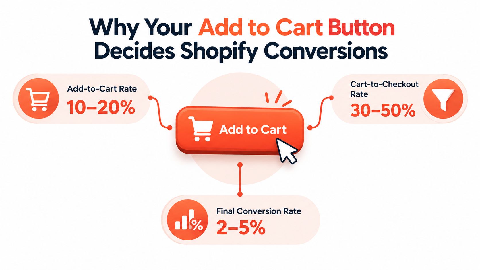
The button exposes several different problems
Suppose a shopper clicks Add to cart and nothing visible happens. The event might have fired, but the customer doesn't know that. Another shopper may see a success message but lose the selected size because a theme script submitted the first variant in the product object instead of the chosen variant ID. A third may reach checkout successfully, but only after tapping a small control several times on a narrow screen.
These aren't styling issues. They involve state management, form serialization, cart responses, and communication. The fix might belong in Liquid, JavaScript, CSS, the cart drawer, or analytics configuration.
Practical rule: Treat every add-to-cart interaction as a short workflow. The customer chooses a valid variant, submits it, receives confirmation, and can understand what to do next.
That approach also changes prioritization. Before redesigning a footer or adding another promotional popup, inspect whether the primary product action is reliable and measurable. A button that loses variant data or provides no confirmation can undermine every acquisition channel sending shoppers to the page.
For merchants who want a broader orientation to Shopify's storefront structure, the Blu Dragonfly Shopify walkthrough provides useful platform context. The implementation work below narrows that context to the product form and the systems surrounding it.
How Shopify Renders the Add to Cart Button and How to Customize It
Shopify's standard product form already handles an important part of the transaction. Your theme renders a product form, includes a selected variant ID, and submits that value to Shopify's cart endpoint. Custom work should preserve that foundation rather than replacing it with a disconnected button that happens to look right.

Start with the product form
In the Shopify admin, open Online Store, choose Themes, select the theme you want to inspect, and use the code editor or theme customizer depending on the change. The exact file differs by theme. Broadcast and Palo Alto, for example, organize product functionality differently from a minimal custom theme, so search for the product form, buy buttons block, or product form JavaScript rather than assuming a universal filename.
The essential Liquid responsibilities are:
Render the form: Use Shopify's product form object and preserve the form action that adds an item to the cart.
Submit the selected variant: The hidden or visible variant input must reflect the active selection, not merely the first available variant.
Respect availability: Sold-out variants should disable the action or communicate why the shopper can't proceed.
Support selling plans when relevant: Subscription products need their selected selling plan passed with the line item.
Keep quantity behavior intentional: If quantity is editable, validate it and ensure the submitted value matches the interface.
A typical implementation includes a product form, a variant ID input, a quantity input when needed, and a submit button. The button should remain a real HTML submit control. Avoid using a generic div with a click listener as the primary action, because that creates keyboard and accessibility problems before any visual customization begins.
Add AJAX only when the experience needs it
AJAX is useful when the shopper should remain on the product page, see a cart drawer, or receive an inline confirmation without a full page navigation. The script should serialize the same product form the browser would submit, send the selected variant ID and quantity to Shopify's cart endpoint, then update the cart state from the response.
A reliable sequence looks like this:
Validate the form and confirm that a variant is selected.
Disable the submit control while the request is in progress.
Send the form data to the cart endpoint.
Handle success by updating the cart drawer, count, subtotal, and confirmation message.
Handle errors by restoring the button and explaining the problem in the interface.
Re-enable the control when the request finishes.
Don't build a second variant-selection system inside the AJAX handler. The variant picker should remain the source of truth, and the request should read its current value at submission time. This prevents a common production bug where the visible color or size changes, but the request still contains an earlier variant.
For more detail on organizing theme code into maintainable sections, see Presidio's guide to sections in Shopify. The same principle applies here: isolate the product form, cart interaction, and presentation logic so a future theme update doesn't require untangling one oversized script.
Handle edge cases before launch
Test more than a successful single-variant product. Check products with multiple options, unavailable combinations, quantity limits, subscription plans, quick-add cards, and products that should redirect directly to the cart. Test a slow connection too. A fast local response can hide duplicate submissions, stale loading states, or a cart drawer that opens before its contents finish rendering.
The best customization is usually incremental. Keep Shopify's form semantics, add a controlled AJAX layer when it improves the journey, and make every state explicit. That gives designers room to change the interface without asking developers to rebuild core commerce logic.
Styling States and Mobile Behavior That Drive Clicks
A trustworthy add-to-cart button tells shoppers what it can do now, what it's doing after a tap, and what happened afterward. The visual treatment should support the product page hierarchy, but it also needs to communicate state without relying on animation or color alone.
Begin with the default state. Place the button close to the price, selected options, and purchase details so the shopper doesn't need to hunt for the next action. Use sufficient contrast against its background, preserve a visible focus indicator, and make the label specific enough to distinguish an available purchase from an unavailable one.
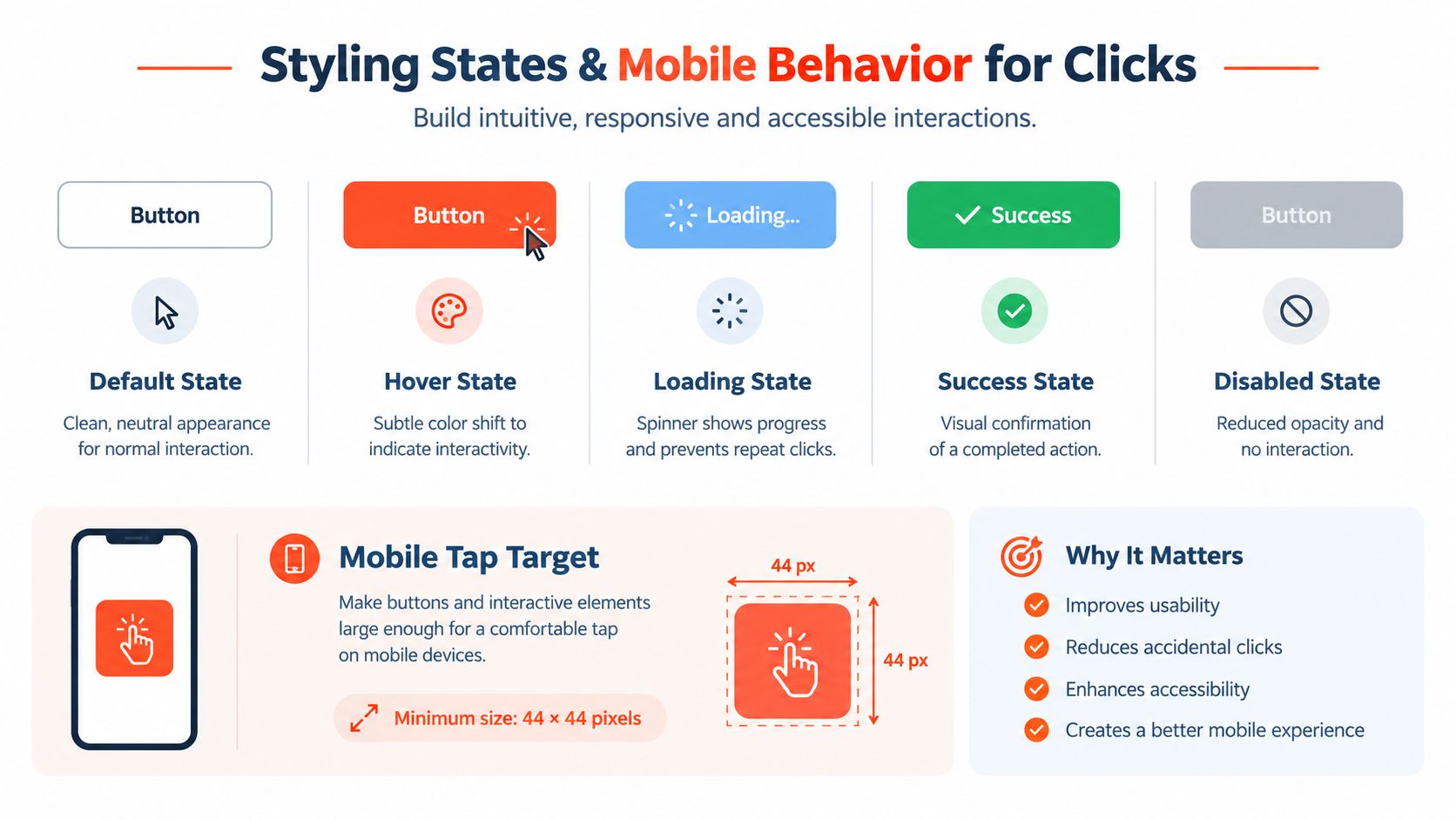
Design the complete state set
A button that only has a normal and hover style is unfinished. Production storefronts need at least these states:
Default: The action is available and the label is readable at a glance.
Hover: Desktop shoppers receive a restrained color or elevation change, without shifting the button's dimensions.
Loading: The label or adjacent indicator communicates that the request is processing, while the control prevents duplicate submissions.
Success: A checkmark, cart update, drawer opening, or concise message confirms that the item was added.
Disabled: The control explains why it can't be used, such as a missing option or unavailable variant, rather than appearing mysteriously inactive.
Don't replace the entire label with a spinner and leave the shopper guessing. A label such as “Adding” paired with a status indicator is clearer than motion alone. After success, return the control to its normal label unless the next action requires a different prompt.
Make mobile interaction forgiving
Mobile shoppers need a button that stays visible within the product information flow without covering variant controls, product media, chat widgets, or consent interfaces. A full-width control often works well, but the surrounding spacing matters just as much as width. Keep enough separation from adjacent controls so an accidental tap doesn't change quantity or open a different element.
Test with one hand, a long product title, a validation message, and the on-screen keyboard open. Variant errors should appear close to the relevant picker, not only at the top of a long page. If the button moves during image loading or dynamic content rendering, shoppers can tap the wrong location even when the control itself is technically large enough.
A fast interface isn't one that animates quickly. It's one that makes the result of every action obvious.
For teams managing several components across a theme, a documented design system helps prevent one product template from drifting away from collection cards or quick-add controls. Presidio's Shopify design system guidance covers the broader rationale for shared tokens, states, and component rules.
Use motion sparingly. A short transition can make a cart drawer feel connected to the action, but the success message must remain understandable when animation is disabled or unavailable. The button's meaning should survive without hover, color change, or visual flourish.
When a Sticky Add to Cart Button Helps and When It Hurts
A sticky add-to-cart control solves one specific problem: the primary purchase action has scrolled out of view. It isn't a universal conversion upgrade, and adding it to every product page can create visual competition with content, navigation, and other fixed elements.
The strongest case is a long product detail page where shoppers read specifications, reviews, ingredients, or fit information and must scroll repeatedly to return to the original buy box. In one desktop A/B test on a long product page, a fixed sticky add-to-cart button produced 7.9% more completed orders at 99% statistical significance, while a drawer-style alternative increased orders by 5.2% at 98% significance and increased add-to-cart clicks by 11.8%, according to the Growth Rock sticky add-to-cart test.
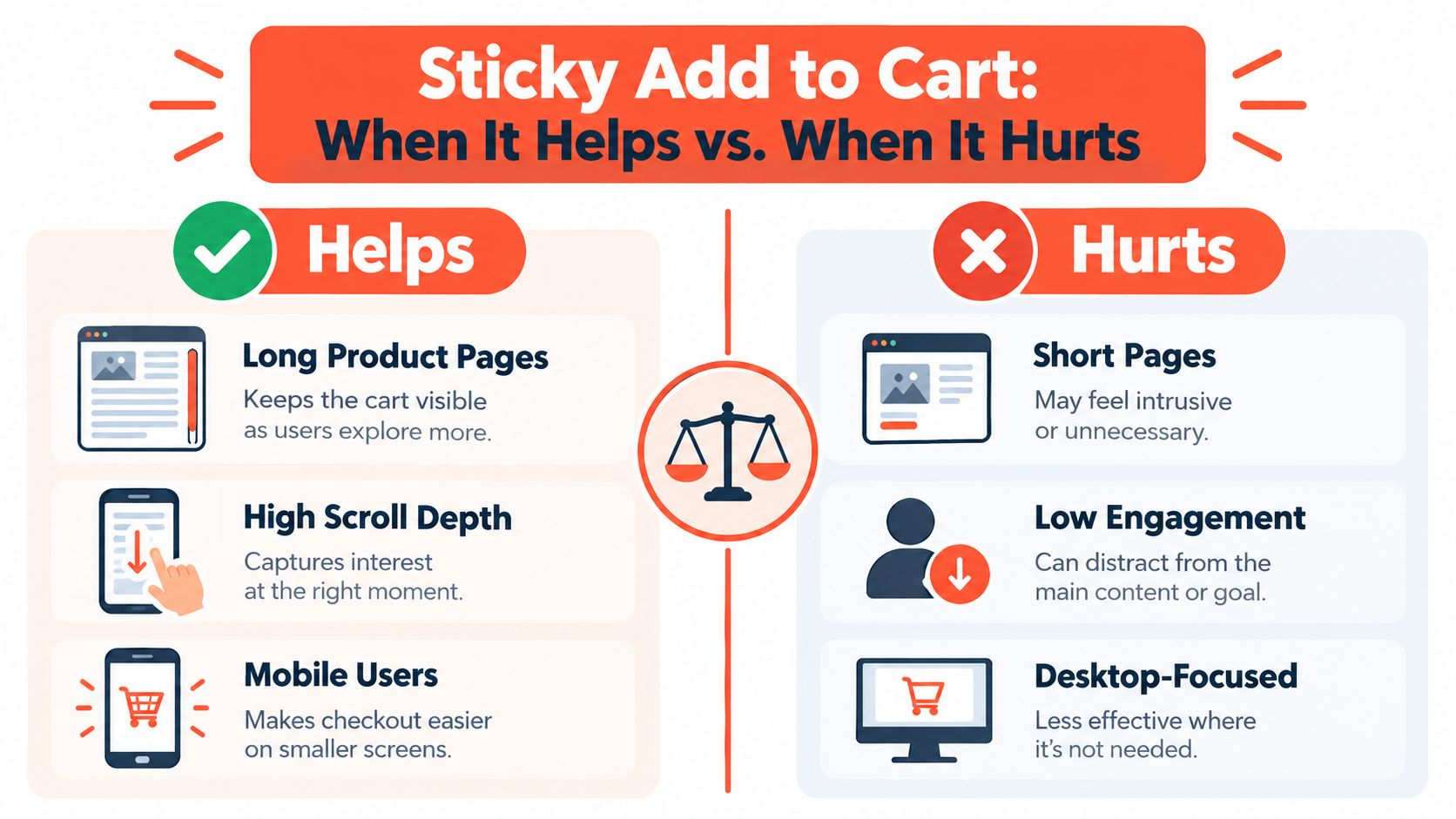
Use page context instead of fashion
Before implementing persistence, inspect the page itself:
Long-form PDP: A sticky control may reduce the effort required to return to the purchase action.
Short PDP: If the original button stays visible or returns quickly, a sticky element may add clutter without solving friction.
Mobile layout: A fixed bottom bar can help, but it consumes valuable screen space and must account for browser UI and other overlays.
Complex options: A sticky shortcut may need to open the variant area rather than submit an incomplete selection.
Content-heavy browsing: The control should remain present without obscuring reviews, images, or important product information.
The test metric matters as much as the treatment. Track completed orders and revenue per visitor alongside add-to-cart clicks. A sticky element that creates more cart activity but no downstream purchase improvement may move abandonment later in the funnel.
A practitioner summary covering 33 sticky CTA A/B tests reported a 27% win rate, while another set of 16 tests reported a 12.5% win rate, as detailed by Conversion Rate Experts' sticky CTA report. The lesson is not that sticky controls fail. Most variants don't beat control, so the page must justify the intervention.
Testing rule: Add persistence only after confirming that the original CTA genuinely disappears during meaningful product research.
Use a clean control and one meaningful variation. Don't change copy, product imagery, discount messaging, and sticky behavior in the same experiment. Segment results by device and page type, then judge the effect on orders rather than treating a click increase as the finish line.
This decision also belongs in a broader abandonment review. The shopping cart abandonment playbook from MD TECH TEAM can help teams examine what happens after the shopper has already committed an item to the cart.
Making the Add to Cart Button Accessible and Compliant
A visible button isn't necessarily an accessible button. The control must be operable from a keyboard, announced meaningfully by assistive technology, and clear about what changed after an asynchronous add.
A 2025 scan of 84 cart and checkout URLs across 100 large ecommerce sites found only 11% were WCAG-compliant, according to the AccessibilityChecker ecommerce accessibility study. The finding applies to a broader cart and checkout journey, but it highlights why visual placement alone isn't a sufficient accessibility strategy.
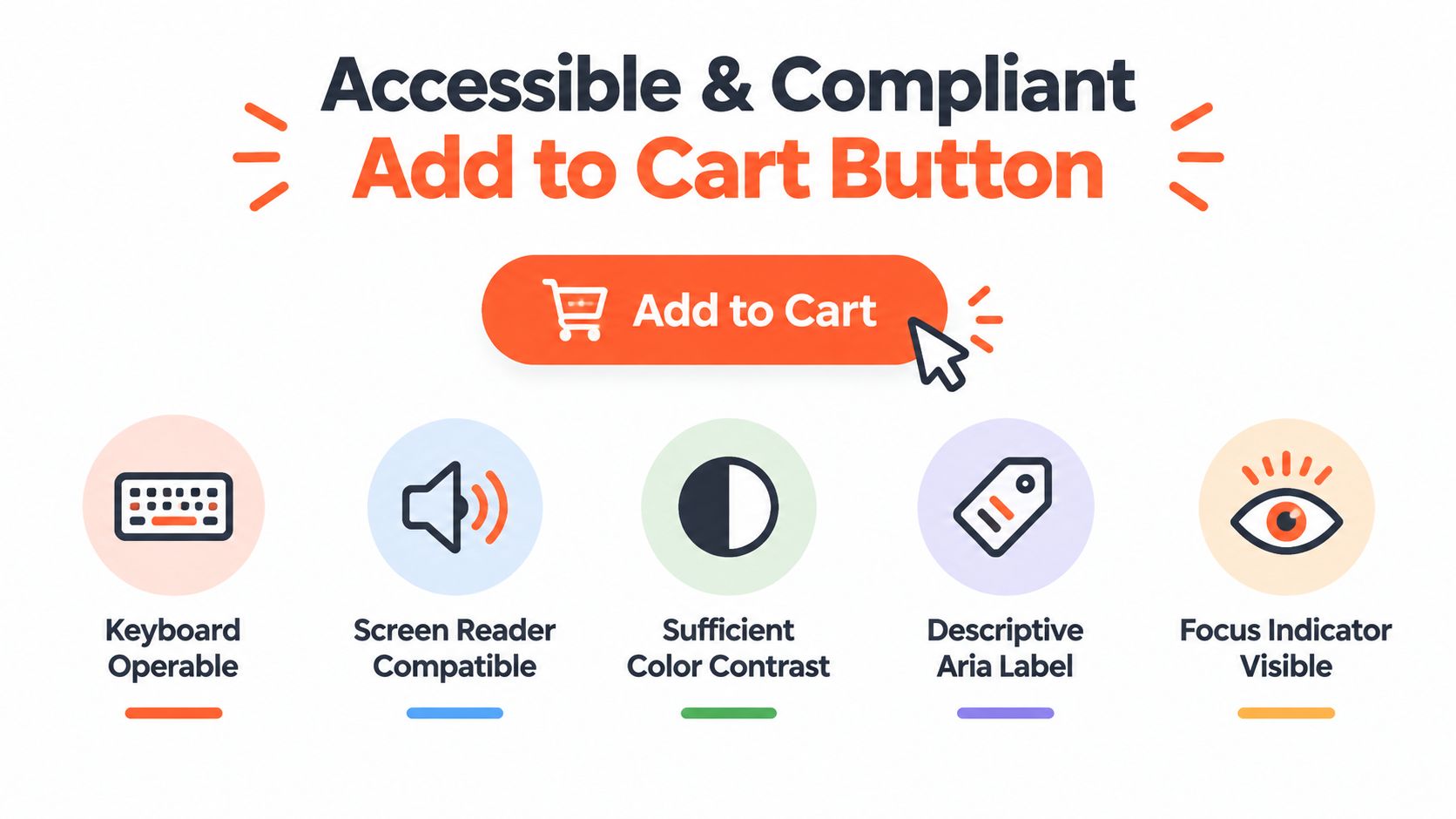
Start with native semantics
Use a real <button> or a correctly associated submit control inside the product form. Keyboard users should be able to reach it in a logical order, activate it with standard keyboard behavior, and see where focus is at all times. Don't remove the outline without providing a visible replacement that meets the design system's contrast requirements.
The label should communicate the action and context. “Add to cart” is generally clearer than an icon-only control, and a product-specific accessible name can help when several purchase controls appear on a page. If a variant is missing, announce the required choice near the picker and ensure the button's disabled state doesn't hide the reason.
Announce AJAX results
AJAX removes the browser's natural page transition, so your implementation must replace the lost feedback. Add a status region that can announce success and errors to screen readers, such as confirmation that the selected product was added or an explanation that inventory prevented the request.
Focus management needs equal care. Opening a cart drawer should move focus into the drawer in a predictable way, provide a clear close control, and return focus to a sensible element when the drawer closes. If the interface updates an inline cart count instead, the update should be perceivable without forcing a screen reader user to search the page.
Common failures include non-working keyboard activation, missing confirmation, vague button text, and loading states that never resolve. These issues can affect shoppers who use keyboards or assistive technology, but they also expose weak state handling for everyone else.
Test the interaction, not only the markup
Run a keyboard-only pass through variant selection, quantity changes, submission, error recovery, and cart drawer dismissal. Then test with a screen reader and at different zoom levels. Check that focus doesn't disappear behind a sticky bar and that the button remains visible when text expands or validation messages appear.
Accessibility work should happen in the component's first implementation, not as a late compliance patch. A semantic form, clear state messages, and controlled focus behavior produce a more durable experience than visual fixes layered over inaccessible markup.
Tracking Testing and Optimizing Your Add to Cart Button for Growth
A button can't become a growth asset until the team can connect its interaction to the revenue journey. Track the product, variant, quantity, device context, page template, and outcome of the event. In Shopify analytics and GA4, distinguish an add-to-cart event from a completed purchase, because the first action measures intent while the second validates commercial impact.
Start with event integrity before changing the interface. Use browser debugging tools and a test order flow to confirm that one click creates one event, the selected variant is correct, and failed requests don't appear as successful additions. If the cart drawer updates without a page reload, verify that the analytics event still fires reliably.
Prioritize tests that answer business questions
Test one meaningful variable at a time. Button copy can reveal whether shoppers need more clarity. Placement can show whether the original buy box disappears too early. A sticky treatment can test scroll friction. Loading feedback can expose whether shoppers are submitting twice because the interface feels unresponsive.
Test Idea | What to Measure | Expected Learning |
|---|---|---|
Button label and state copy | Add-to-cart events, completed orders, revenue per visitor | Whether the current language makes the next action clear |
Variant validation and error messaging | Form errors, successful adds, support issues | Whether shoppers understand what must be selected |
Sticky treatment on long PDPs | Add-to-cart events, completed orders, revenue per visitor by device | Whether persistent access reduces meaningful scroll friction |
AJAX cart drawer versus page navigation | Completed orders, cart engagement, error rate | Whether staying on the page improves continuity |
Button placement near purchase details | Engagement and downstream purchase behavior | Whether the visual hierarchy supports decision-making |
For a practical framework around experiment design, see Presidio's Shopify A/B testing guide. Keep the roadmap small enough that developers can maintain the variants and analysts can interpret the results. A test that produces ambiguous tracking is not a learning asset, even if the interface looks polished.
The right operating cycle is simple: audit the form, instrument the events, identify the clearest friction, test a focused change, and judge the result against orders and revenue. Treat the add-to-cart button as a connected system, and every improvement teaches you more about the product page rather than merely producing a prettier control.
Presidio builds and supports maintainable Shopify and Shopify Plus themes, apps, AJAX cart experiences, accessibility improvements, and CRO testing programs. Visit Presidio to discuss an audit or implementation that connects your Liquid form, cart behavior, analytics, and ongoing optimization.

Jamie, Presidio’s Designer, leads the practice alongside Johnnie. With over 10 years of e-commerce experience, Jay is a Shopify expert, known for crafting innovative solutions that prevent tech debt.
Jaime
Senior Product Designer, 2020