Outrank AI

You're probably in one of two situations right now. Either you're staring at a row of polished Shopify demos that all look good enough, or you already picked one and you've started to notice the cracks. The homepage looks sharp, but collection pages feel crowded, product templates break when merch adds real content, and every missing feature turns into another app install.
That's why choosing a theme is rarely a design decision alone. It's an operating model decision. The theme you choose will shape page speed, accessibility, merchandising flexibility, how many apps you need, and how painful future changes become once the store is live.
Shopify formalized this decision a long time ago. Its official Theme Store launched on April 22, 2010, which created a marketplace for developer-built templates instead of forcing merchants to rely only on custom storefronts, and by 2026 independent ecosystem trackers estimated Shopify had more than 3 million live stores and over 4,000 themes in circulation according to Shero Commerce's Shopify history overview. At that scale, theme selection isn't a cosmetic preference. It's infrastructure.
Table of Contents
Why Choosing a Shopify Theme Is a Systems Decision
A theme looks like front-end design. In practice, it touches almost every part of store operations.
I've seen teams choose a theme because the demo felt premium, only to rebuild major parts of it later. The usual pattern is predictable. A merchant picks the theme with the nicest homepage animations, then runs into problems when they add subscriptions, bundles, region-specific messaging, product education, or a denser catalog structure. The theme wasn't wrong for launch day. It was wrong for the actual business.
The hidden cost of an attractive demo
A demo store is built to flatter the theme. Your store won't be.
Real stores have long product titles, uneven photography, out-of-stock variants, promotional badges, metafield-driven content, legal copy, app blocks, and campaign landing pages that weren't in the original demo. Once those arrive, the theme starts showing its real behavior. Some stay stable. Some become brittle fast.
Practical rule: If a theme only looks good with perfect content, it's not a strong foundation.
This is why choosing a theme should sit closer to platform architecture than visual inspiration. It affects whether marketers can launch pages without developers, whether merchandising can work inside native sections, and whether engineering can update the theme without untangling custom patches every quarter.
Teams that already think in systems usually make better picks. They ask questions like:
Can the theme absorb complexity? Product variants, rich media, subscriptions, bundles, and content-heavy PDPs tend to expose weak theme structure quickly.
Will this reduce app dependence? Native merchandising features matter more than an overloaded demo.
Can we maintain it cleanly? A theme that needs constant code exceptions creates long-term drag.
Does it fit our front-end model? If your team already works with a documented Shopify design system approach, theme choice should support that structure, not fight it.
Theme debt shows up later
Bad theme debt doesn't announce itself on day one. It shows up after launch as slower pages, accessibility regressions, duplicated templates, app conflicts, and “small” customizations that keep turning into expensive work.
The merchants who avoid that trap usually do one thing differently. They treat the theme as the base operating layer for commerce, not just the visual skin.
Define Your Requirements Before You Browse
Most theme searches start too early. People open the Theme Store before they've written down what the store needs to do.
That leads to impulse decisions. A strong theme for one brand can be a bad fit for another if the catalog behaves differently, if merchandising relies on custom product education, or if operations need heavy app integration. Shopify's own guidance points buyers toward theme filters like industry and catalog fit in its theme selection documentation, but that's only the starting layer.
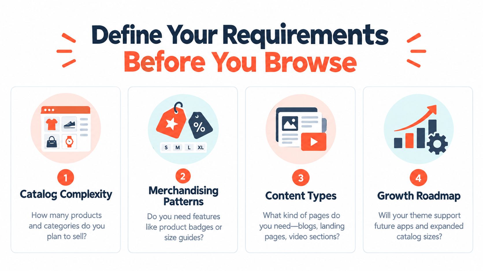
Build a one-page requirements brief
Before browsing themes, write a short brief that your team can agree on. Keep it blunt. If a requirement matters after launch, it belongs here.
Include these categories:
Catalog shape: Are you selling a tight hero assortment or a broad catalog with dense collection navigation, filters, and repeat merchandising rules?
Product page complexity: Do you need ingredient callouts, comparison tables, subscriptions, bundles, routine builders, or education-heavy content blocks?
Content model: Will the store rely on landing pages, editorial modules, video, blog storytelling, or wholesale-style utility pages?
Operational constraints: Who will maintain the site after launch? A merchant team using the theme editor needs a different setup than a dev-led team.
International needs: Consider localization, market-specific messaging, translated navigation, and layout stress from longer copy.
System dependencies: List integrations and app categories that aren't optional, especially subscriptions, reviews, loyalty, search, personalization, ERP-connected workflows, and custom discount logic.
Separate must-haves from expensive nice-to-haves
Discipline matters. Don't treat every wishlist item as equal.
A smart brief usually has three buckets:
Must support natively
Acceptable through apps or light customization
Not needed at launch
That exercise reveals a lot. If a theme supports your core merchandising patterns in native sections, it will usually stay cleaner over time. If your must-have list immediately requires a stack of overlays, widgets, and script-heavy enhancements, the theme is probably a poor fit.
A theme should cover the store's normal operating mode. It shouldn't need rescue apps just to feel complete.
Use requirements to kill weak options fast
The brief isn't paperwork. It's a filter.
Once you have it, you can eliminate themes quickly. A visually strong theme that fails your product-page content model is out. A fast-looking theme with rigid collection layouts is out. A trendy theme that forces developers into custom code for routine marketing requests is out.
That clarity saves more time than endless demo browsing.
How to Evaluate Performance Accessibility and Extensibility
Once you've narrowed the field, stop looking at aesthetics and start measuring behavior.
Shopify gives you a better framework than most merchants use. Its published testing method uses a standardized development store, a fixed product CSV, and Lighthouse runs on the home, product, and collection pages. The final score is calculated with the weighted formula [(p × 31) + (c × 33) + (h × 13)] / 77, each page is tested at least three times, and the median result is used to reduce noise according to Shopify's theme performance documentation. Shopify also sets a minimum average Lighthouse score of 60 for Theme Store performance in that process.
That matters because plenty of themes look fast in a demo and fall apart under repeatable mobile testing.
Performance needs a controlled process
Use a repeatable setup. Test on mobile. Test the same page types every time. Don't let one lucky run convince you a theme is fast.
Shopify's own aggregated data also shows that theme quality varies across the ecosystem. Median theme pass rates are 94.5% for Largest Contentful Paint, 94.0% for Cumulative Layout Shift, 97.2% for Interaction to Next Paint, and 86.1% for passing all Core Web Vitals in the Shopify theme performance data table. The same source notes that one 2026 tracker estimated Dawn at 616,619 stores, or 24.8% of all Shopify stores, which shows how much one theme standard can shape merchant behavior at scale.
If you're auditing finalists, a structured Shopify performance optimization workflow helps because it forces teams to compare like with like instead of reacting to demo impressions.
Accessibility is not a bonus round
A theme can be stylish and still create obvious accessibility problems once custom content and apps get layered in.
Shopify requires a minimum average Lighthouse accessibility score of 90 for themes in the Theme Store, measured across benchmark pages, and documents a benchmark-shop workflow for calculating that score in its Theme Store accessibility requirements overview. That should change how you evaluate themes. Accessibility isn't something to “clean up later” after design approval.
Check the basics yourself. Keyboard navigation, visible focus states, semantic headings, contrast, modal behavior, and readable error states tend to expose weak themes quickly.
If a theme needs heavy custom interaction patterns to feel premium, test accessibility before you fall in love with it.
Shopify Theme Evaluation Scorecard
Criterion | How to Test | Pass Threshold |
|---|---|---|
Performance | Run Lighthouse on mobile for home, product, and collection pages. Test each page at least three times and use the median. | Meets Shopify's published minimum average Lighthouse score of 60 |
Accessibility | Run Lighthouse accessibility checks across benchmark pages, then manually review keyboard flow, focus states, semantics, and contrast. | Meets Shopify's published minimum average accessibility score of 90 |
Extensibility | Review section flexibility, metafield support, app block handling, template logic, and how easily the team can add content without custom code. | Supports your store's required workflows without forcing routine developer intervention |
Extensibility is the least discussed category, but it usually decides whether the build ages well. A theme isn't extensible because it has a lot of settings. It's extensible if your team can adapt it without making the codebase fragile.
Test Drive Themes With Real Store Content
Most bad decisions could have been avoided.
A merchant previews a theme with clean demo products, a short menu, and polished images. Everything feels smooth. Then they install it, import the catalog, and discover collection cards wrap awkwardly, variant selectors break the layout, badges collide with prices, and app blocks push key content below the fold.
That's why the only useful preview is one built with your own store reality.
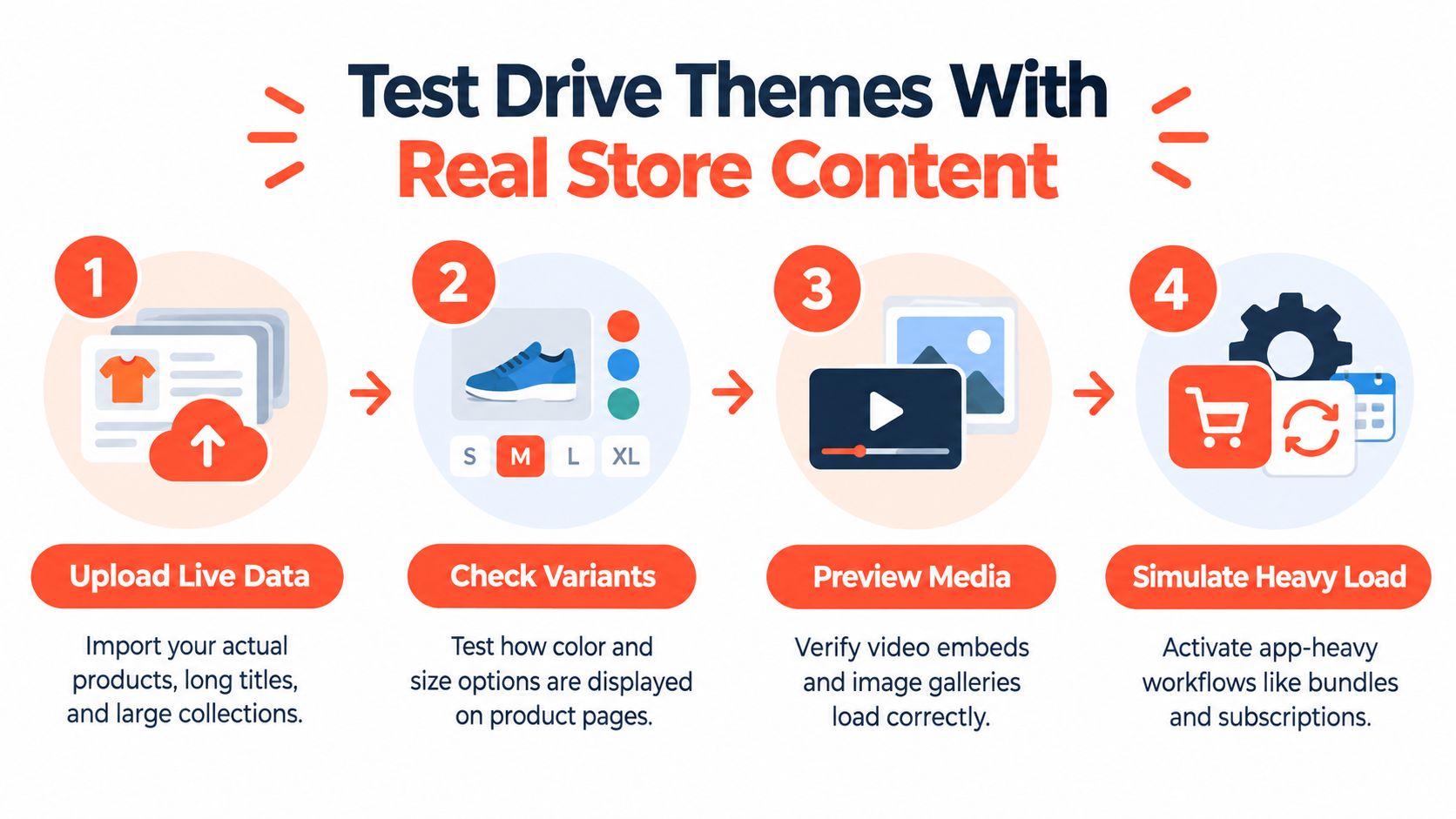
Build a realistic preview environment
Set up a preview store or duplicate environment and load it with content that stresses the theme.
Use:
Actual product titles: Long names break layouts that look fine in demos.
Real collections: Include broad categories, edge-case tags, and uneven product counts.
Live merchandising blocks: Add promo badges, swatches, comparison content, and urgency messaging.
True media formats: Test image-heavy SKUs, video, and mixed gallery content.
Variant-heavy products: Complex option structures often reveal weak PDP interaction patterns.
If you're migrating from another platform, don't clean up the data for the theme's benefit. Let the data be messy. That's the point.
Walk the mobile journey end to end
Desktop previews are where merchants get fooled. The test is mobile.
Run through the actual path a shopper takes:
Land on the homepage or campaign page
Enter a collection
Filter or browse
Open a product
Change variants
Read selling content
Add to cart
Interact with upsells, subscriptions, bundles, or sticky CTAs
Continue to cart
Watch for friction, not just breakage. A theme can technically work and still create drag through awkward scroll depth, jumpy sticky elements, or poor information hierarchy.
The best theme preview usually feels a little uncomfortable, because real content exposes things the demo hid.
Test app-heavy workflows before purchase
Maintainability often gets decided.
Activate the workflows you know you'll need. That includes subscriptions, bundles, personalization, quiz paths, review widgets, search overlays, loyalty prompts, and discount logic if they affect storefront rendering. If the theme can't absorb those cleanly, the issue won't get easier after launch.
Independent guidance on choosing themes has started moving in this direction too. A 2026 review of 85,445 Shopify stores found Horizon was the fastest-growing named theme, rising from 554 stores to 638 in 120 days, according to Werner Strauch's Shopify themes analysis. The broader takeaway isn't that you should copy growth themes. It's that merchants are starting to compare themes with more evidence and less homepage bias.
A useful test session ends with notes, not vibes. Record what broke, what needed workaround logic, and what your team could realistically maintain.
Customization App Compatibility and Long Term Maintenance
The launch build is only half the story. Cost of choosing a theme shows up in the months after go-live.
A good theme gives you room to customize without turning every change into a code event. A weak one pushes you toward layered fixes. One app for badges. Another for bundles. Another for FAQs. Another for product education. Soon the store works, but nobody wants to touch it.
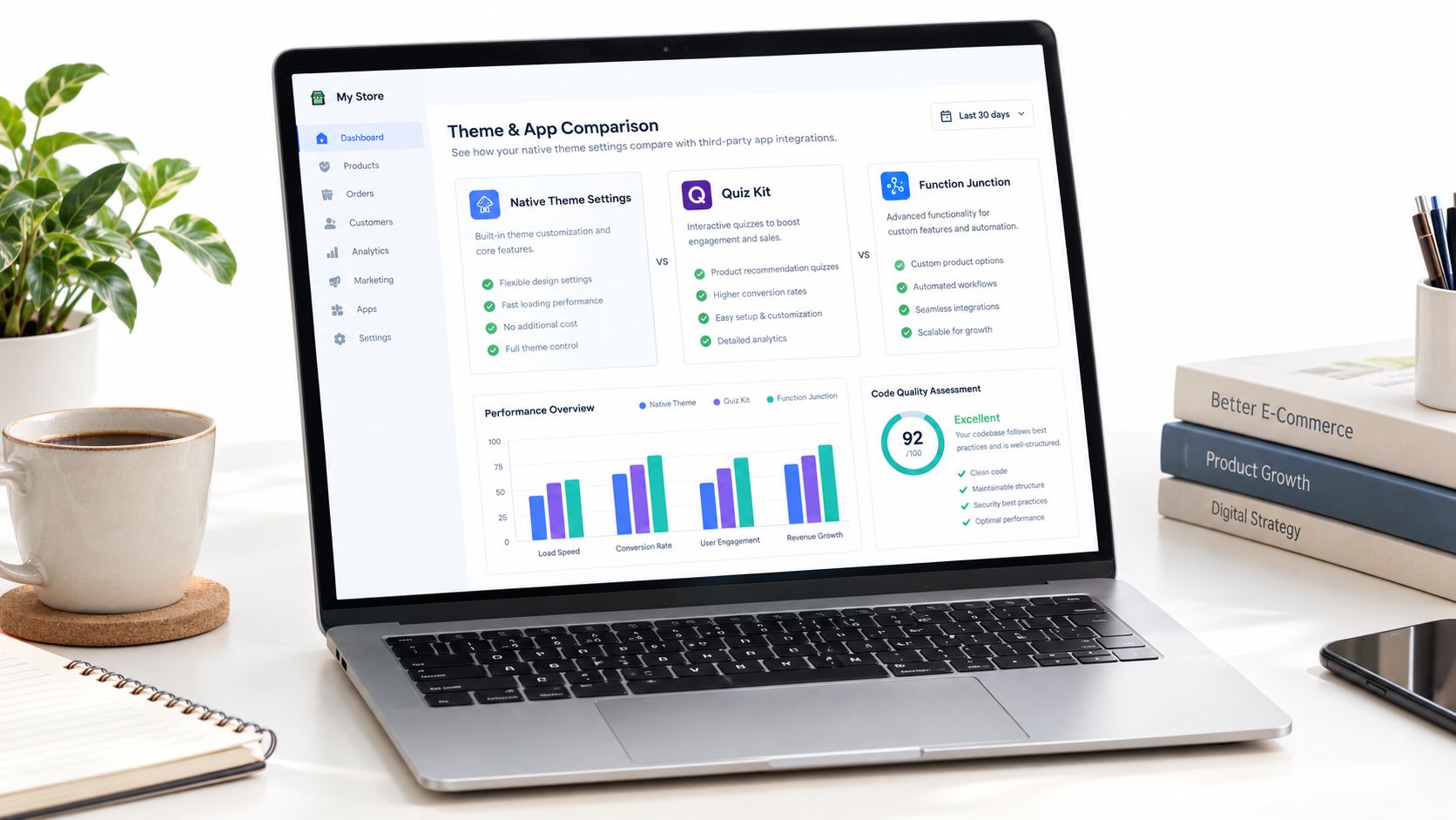
Favor native capability first
The cleanest stores usually rely on native theme sections and platform primitives wherever possible. That doesn't mean “never use apps.” It means apps should solve actual business gaps, not compensate for a poor foundation.
A practical review looks like this:
Native first: Can the theme already handle badges, trust content, video, cross-sells, FAQ layouts, and campaign blocks?
App-aware second: If you add subscriptions, bundling, or personalization, does the theme leave enough structure and layout control for those tools to fit cleanly?
Custom last: Reserve custom code for things that create real differentiation, not for ordinary storefront behavior.
If you need custom logic, document it carefully and isolate it. That makes theme updates less risky later. For brands comparing native theme edits with deeper implementation work, Shopify theme customization options are useful to frame what belongs in settings, what belongs in apps, and what belongs in code.
Maintenance is part of the selection decision
A maintainable theme has readable structure, predictable settings, and fewer “magic” dependencies. It also tolerates updates without breaking every enhancement around it.
Lean-build thinking matters most. If a theme supports the needed merchandising features natively, you cut down app sprawl. If custom components are necessary, keep them limited and aligned with the theme's patterns. That reduces regressions in performance and accessibility, especially when teams add new campaigns under deadline pressure.
Presidio's premium themes, including Broadcast, Palo Alto, and Modular, are examples of off-the-shelf options merchants can evaluate when they want no-code customization through the theme editor while still keeping a structured base. They should be judged the same way as any other candidate. Against requirements, app fit, and maintenance burden.
A theme is scalable when the marketing team can move fast without leaving the codebase worse every month.
Make the Final Call and Launch With Confidence
By the time you've done the work above, the decision should feel narrower and less emotional. That's a good sign.
The strongest choice usually isn't the flashiest theme in the demo lineup. It's the one that fits your content model, clears your technical gates, works with your required apps, and won't punish the team for ordinary growth. That's what choosing a theme well looks like.
Use a final decision checklist
Before you commit, compare your finalists against a short launch checklist:
Requirements fit: Does the theme support your must-haves without workaround-heavy customization?
Performance gate: Has it passed your repeatable mobile testing process?
Accessibility gate: Has it cleared both automated checks and manual interaction review?
App compatibility: Have your critical workflows been tested in preview, not assumed?
Editor usability: Can non-developers manage the store without breaking layouts?
Maintenance risk: Will future updates stay manageable, or are you buying long-term debt?
Launch carefully, not casually
Once you choose, add the theme to the library and configure it in a controlled environment first. Review global settings, template defaults, and section behavior before anyone starts layering in custom code. If you do customize, duplicate the theme before major edits and keep a clean rollback path.
After launch, keep monitoring the store with the same discipline you used during selection. Watch mobile behavior, app interactions, and key page templates as the merchandising team adds more content. A theme that starts clean can still get bloated if governance disappears.
If every finalist fails for a different reason, that's useful too. It usually means the business has outgrown off-the-shelf compromises and should consider a more custom theme direction.
Presidio builds and supports Shopify storefronts, themes, and apps for brands that need speed, flexibility, and a cleaner long-term operating model. If you're choosing a theme now and want help pressure-testing performance, accessibility, app fit, or whether you've outgrown off-the-shelf options, visit Presidio.

Jamie, Presidio’s Designer, leads the practice alongside Johnnie. With over 10 years of e-commerce experience, Jay is a Shopify expert, known for crafting innovative solutions that prevent tech debt.
Jaime
Senior Product Designer, 2020