Outrank AI

Your shopper is already halfway through a purchase, and the page keeps asking for more decisions. They're scanning a crowded menu, opening filters, comparing variants, then hesitating because every path feels equally important. That's the moment Hick's Law UX shows up in ecommerce, not as a theory, but as a real reason people slow down or leave.
The usual advice says to remove options. That's too blunt for Shopify teams. The better question is which choices should be visible now, which should wait, and which should be searchable or preselected so discovery stays intact without forcing people to think too hard. If you're working on personalization, that trade-off gets even sharper, which is why a lot of teams connect this topic with ecommerce personalization software.

Table of Contents
Introduction Why Too Many Choices Stall Shoppers
A shopper lands on a collection page, and the entire store seems to ask for a decision at once. They see navigation links, collection tiles, size filters, material filters, subscription options, and a product page with too many variants. Each extra choice looks small on its own, but together they create hesitation.
That's why Hick's Law matters in ecommerce UX. The principle ties decision time to the number of choices, but the important part is the shape of that relationship, not a lazy “fewer is always better” rule. In practical terms, this means that choice design is really presentation design, not just catalog management.

A cleaner interface can still lose if it strips out the distinctions shoppers need. A colorway, bundle, or subscription tier can't always disappear behind a minimalist shell without making the offer harder to trust. The goal is to reduce friction without flattening the buying decision into something vague.
That's the lens for this guide. You'll see where Hick's Law is useful, where it stops being the right mental model, and how Shopify teams can use it to simplify navigation, product discovery, and checkout without choking off discovery.
What Hicks Law Means in UX and Why It Matters
Think about a restaurant menu with five dishes versus one with fifty. The smaller menu is faster to scan, but the bigger menu isn't automatically worse if the categories are clear and the sections help you narrow in quickly. The same logic applies to ecommerce, where shoppers don't just choose, they interpret, compare, and look for confidence.
Core idea: when choices increase, decision time rises logarithmically, not linearly, so each doubling of options adds roughly a constant delay instead of a straight-line slowdown.
That distinction matters because it changes how you simplify.
For UX teams, that means you shouldn't ask only, “How many options are there?” Ask, “How much mental work does this choice create?” A clean set of six options can feel faster than a messy set of three if the labels are familiar, the layout is clear, and the user understands the stakes. Hick's Law is most helpful when the decision is time-sensitive, like navigation, product selection, or checkout.
Why the logarithmic part matters
The logarithmic part is the bit people often skip. If decision time rose in a straight line, every added option would hurt the same amount. Instead, the brain tends to treat added choices as part of a growing set of comparisons, so the slowdown compounds more gently than that, but it still compounds.
That's why bad simplification can backfire. If you collapse distinct product types into one generic path, shoppers may move a little faster at first, then stall because they can't tell what's different. The interface feels simpler, but the decision feels less safe.
The strongest Shopify use of Hick's Law is not “remove variety.” It's “present variety in a way that lowers perceived complexity.” Progressive disclosure, recommended defaults, and search all help here because they reduce the load of deciding without hiding the catalog itself.
Why Shopify teams should care
Ecommerce is full of moments where speed and confidence are in tension. Navigation has to guide. Filters have to narrow without overwhelming. Product pages have to clarify variants without making the offer look chaotic. Checkout has to reduce hesitation without removing trust signals.
That's why Hick's Law keeps showing up in good Shopify audits. It gives teams a way to talk about friction without falling into empty minimalism. A store can absolutely sell from a rich catalog, but the rich catalog has to be staged carefully or shoppers will feel the weight of it before they understand the value.
Key Factors That Shape Decision Time Beyond Option Count
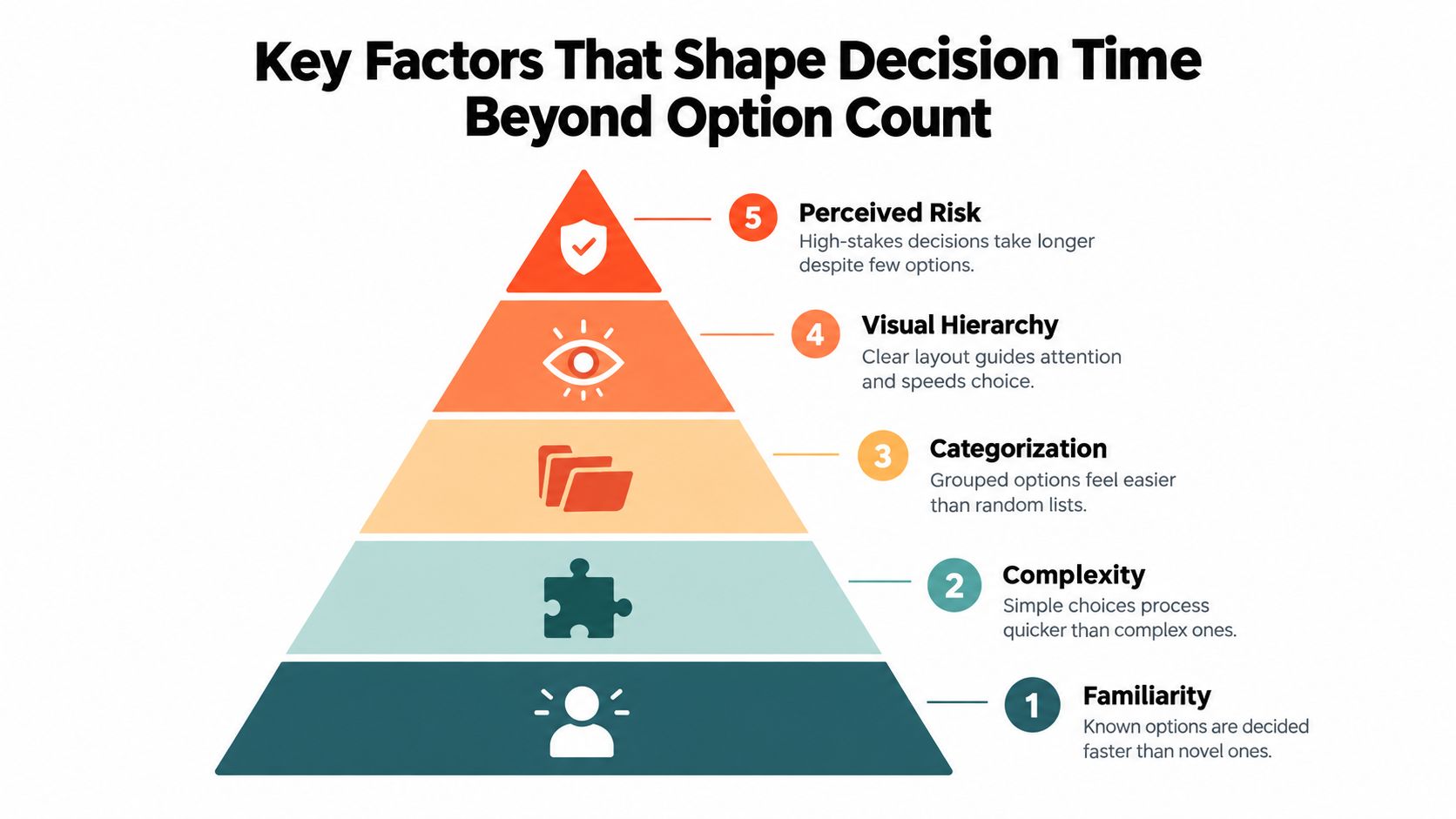
A lot of UI advice treats all choices as equal. They aren't. A familiar option is processed faster than a new one, and a grouped choice is easier to absorb than a random list. The raw number matters, but it's only one piece of the load.
Familiarity and complexity change the pace
A returning shopper who knows your product line moves differently from a first-time visitor. Familiarity speeds decisions because the user already has a mental map, while novelty slows them down because every option needs more interpretation. That's why the same filter set can feel lightweight to one audience and exhausting to another.
Complexity matters in the same way. A simple yes-no choice is easy to process, but a choice with multiple attributes, bundles, or conditional implications takes more effort. If a selection changes the product's use case, price, or commitment level, the mind treats it as higher stakes even when the screen looks tidy.
Structure can reduce load without shrinking the catalog
Categorization and visual hierarchy do a lot of work here. Grouped choices feel easier because the user sees a system, not a pile. A well-ordered filter panel or a clean collection tree can make a larger set of options feel smaller.
Perceived risk sits at the top of the stack. A low-stakes browse decision is one thing, a subscription or expensive bundle is another. Users slow down when they feel they could make the wrong call, even if the interface only shows a few options.
That's why the design problem isn't raw option count. It's the combination of familiarity, complexity, grouping, layout, and risk. Hick's Law gives you the warning sign, but these factors tell you whether the slowdown comes from too much choice or from too little clarity.
Another weakly answered gap is how Hick's Law interacts with choice overload and abandonment in real shopping behavior, especially in modern ecommerce where users often face filters, bundles, subscriptions, personalization, and AI-generated recommendations at once. Recent UX guidance warns against simplifying “to the point of abstraction” and recommends highlighting recommended options instead of removing variety, which is the more useful lens for Shopify teams.
Common Ecommerce Patterns Where Hick's Law Helps or Hurts
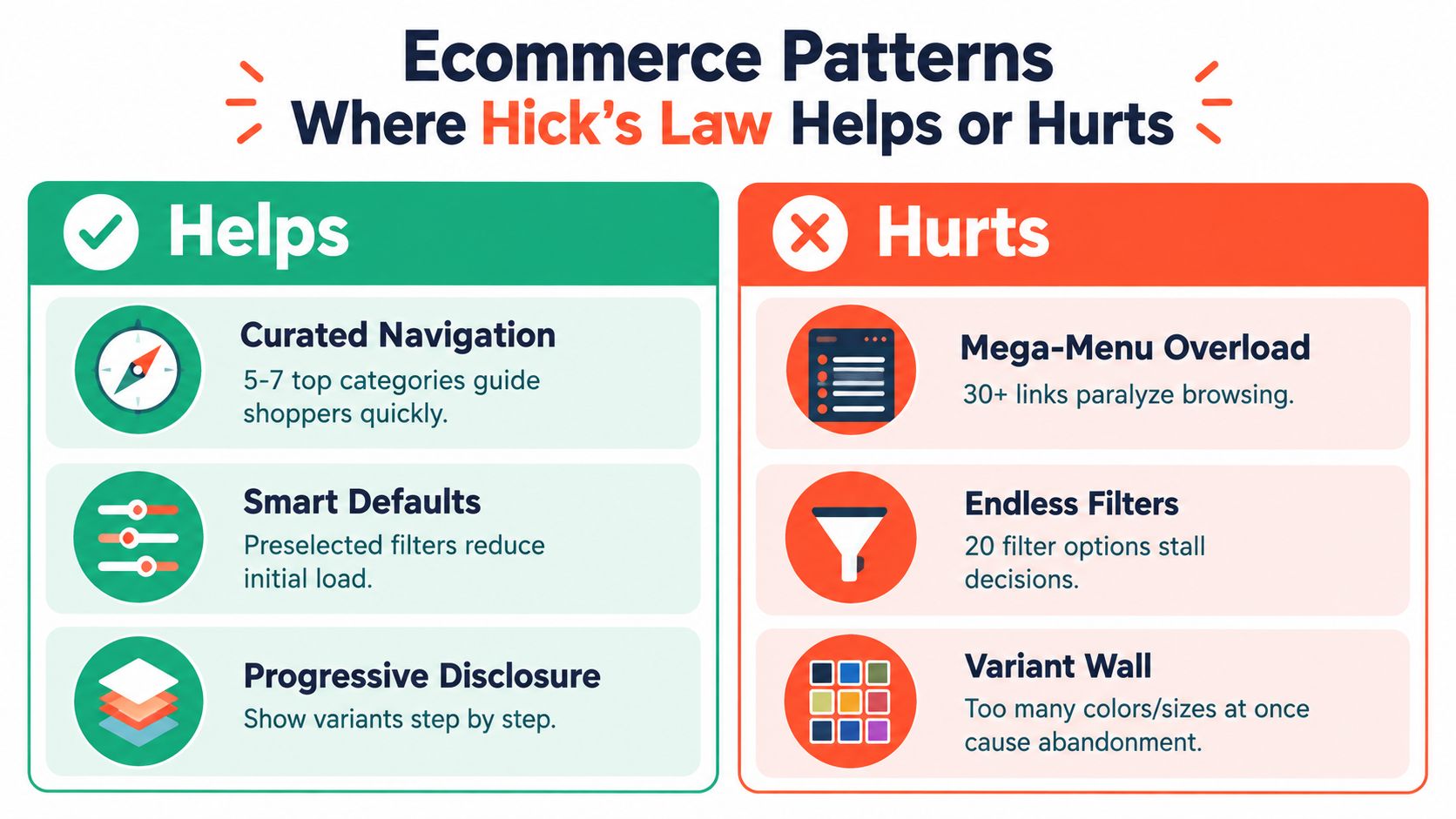
A navigation bar with too many top-level links often slows people down before they've even seen a product. A smaller set of clear categories helps shoppers orient themselves quickly, especially when the labels match how they already think about the store. The difference isn't just visual clutter, it's the feeling of having to sort the store before shopping it.
Where simplification helps
Curated navigation works because it reduces scanning time and clarifies the path forward. Smart defaults help for the same reason, they let the shopper start from a likely choice instead of beginning from zero. Progressive disclosure also belongs here, because it stages complexity instead of dumping every possibility onto one screen.
That's why a quiz-led product finder can outperform a dense grid of similar products. A tool like ecommerce SEO agency Dublin is not the point here, but the broader lesson is that stores with heavy content or complex catalogs often need a more intentional information structure, not just more links and filters.
Where simplification hurts
Over-simplified navigation can hide important distinctions. If a store sells bundles, refill subscriptions, and one-time purchases, collapsing those into one generic path can make the offer harder to compare and easier to distrust. The shopper may not feel “guided,” they may feel boxed in.
The same problem shows up in variant selection. A giant wall of options is bad, but stripping variant context too aggressively can make the product feel like a black box. Shoppers who need comparison, merchandising exploration, or a specific configuration may abandon when the page stops helping them separate the meaningful differences.
The useful pattern to keep in mind is this. Hick's Law helps when the interface is forcing too many decisions at once. It hurts when simplification removes the signals a shopper needs to decide with confidence.
How to Apply Hicks Law to Navigation and Product Discovery
Start with the question, “What must be visible immediately, and what can wait?” That one decision changes everything else. A homepage doesn't need to expose every category, a collection page doesn't need every filter open by default, and a product page doesn't need every variant presented as if they all carry the same cognitive weight.
A practical way to choose the right tactic
Use this rule of thumb. If the user is scanning for orientation, simplify the visible surface. If they're comparing, reveal the relevant options in stages. If they're uncertain or new to the catalog, use search, defaults, or guided entry points so the store does some of the sorting for them.
Here's a simple decision matrix for Shopify teams:
Scenario | Best Tactic | When to Use | Shopify Implementation Hint |
|---|---|---|---|
Broad category browsing | Simplify navigation | When shoppers need fast orientation | Keep top-level paths clear and short, then push deeper choices into subcategories |
Complex filtering | Progressive disclosure | When filters are useful but overwhelming | Show core filters first, tuck secondary filters behind “More options” |
High-variance products | Guided discovery | When shoppers need help choosing the right fit | Use quizzes, recommendation flows, or category landing pages |
Repeated purchase decisions | Recommended defaults | When most shoppers choose the same path | Preselect the most common option, but keep the alternative visible |
Large catalog search | Search-first discovery | When users already know what they want | Make search prominent and keep query refinement easy |
Checkout decisions | Reduce visible choices | When speed and confidence matter most | Keep payment and shipping options focused, clear, and consistent |
A quiz can be useful here too, especially when the catalog has too many branches for a shopper to inspect manually. Presidio's site search guidance for ecommerce is relevant because strong search often does more for discovery than shaving a few items off a menu.
What to change first
Focus on the highest-friction screens first. Navigation, collection pages, product variants, and checkout are the places where unnecessary choice does the most harm. Keep the change small enough that you can see what it affected.
If a decision point is slowing people down, ask whether the store needs fewer visible options, better grouping, a smarter default, or a search path that lets people skip the browse step entirely. The answer is usually not the same on every page.
A/B Test Ideas to Turn Hicks Law Into Conversion Gains
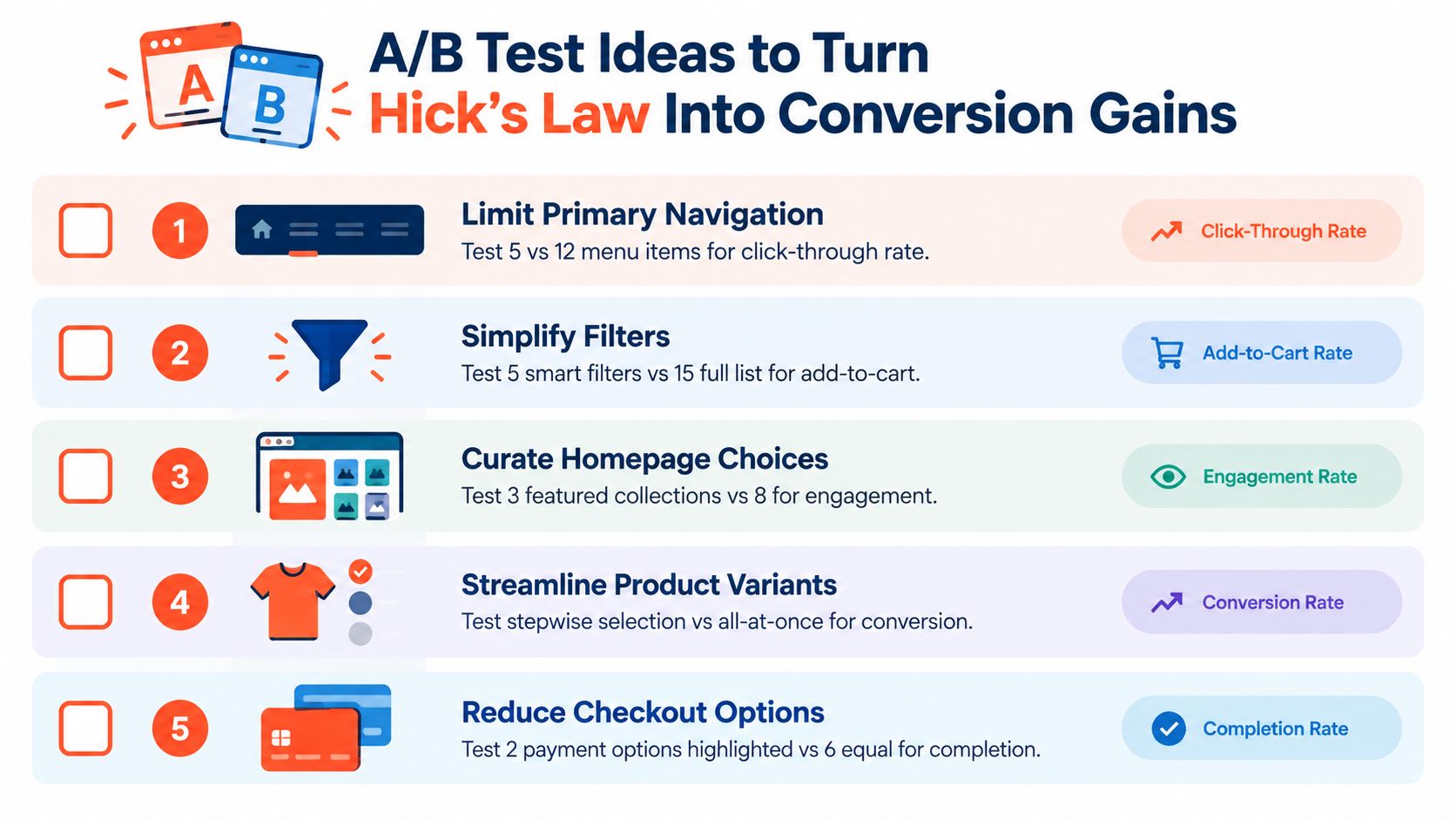
The best way to use Hick's Law in CRO is to turn it into testable friction hypotheses. Don't test “cleaner design” as a vague goal. Test a specific choice reduction, then watch whether shoppers move faster, click more often, or complete the path more reliably.
Good tests start with one decision point
A practical test might compare a shorter primary nav against a fuller one. Another could compare a product page that highlights one recommended variant versus one that treats all variants equally. You can also test whether collapsing secondary filters improves add-to-cart behavior, or whether a guided quiz helps shoppers reach the right collection faster.
If you want a broader testing playbook, you can find A/B testing tips from Bazzly and adapt the ones that fit your catalog. The point isn't to run more experiments. It's to run cleaner ones.
What to measure
Track the delay between showing the choice and the user taking action. Watch click-through on the chosen path, but also watch exits, bounces, and dead-end behavior. A change that looks cleaner but increases confusion hasn't really simplified anything.
Presidio's Shopify A/B testing guide fits this kind of work because Shopify teams often need structured experimentation, not random one-off tweaks. That matters when you're balancing merchandising, UX, and maintainability at the same time.
Practical rule: test one simplification lever at a time. If you reduce navigation, change filters, and alter product defaults together, you won't know which decision helped.
A useful experiment sequence is usually straightforward. Start with navigation if the store feels hard to orient in. Move to filters if collection pages feel heavy. Then test variant presentation and checkout choices once the earlier friction points are under control.
Making Faster Decisions Feel Easier for Every Shopper
Hick's Law is most useful when the shopper needs to decide quickly. It's less useful as a blanket excuse to strip away options everywhere. Rich catalogs can still work when the store presents them with good hierarchy, strong defaults, and search paths that help people skip the busywork.
The practical takeaway is simple. Don't just remove choices, shape them. Put the most useful paths up front, stage the rest, and make the interface feel like it knows what belongs where. That's how you preserve discovery without making every decision feel heavy.
A good Shopify audit usually starts with three questions. Where are shoppers pausing? Which choice screens feel crowded? Which options should be visible now, and which should wait until the user asks for them? If you can answer those well, you're already applying Hick's Law in the way it helps ecommerce.
If your Shopify store feels like it's making shoppers work too hard, Presidio can help you simplify the decision path without flattening the catalog. Their team builds maintainable Shopify storefronts, UX and CRO audits, and product discovery improvements that fit real ecommerce operations. Visit Presidio to see how they approach storefront structure, testing, and ongoing optimization.

Jamie, Presidio’s Designer, leads the practice alongside Johnnie. With over 10 years of e-commerce experience, Jay is a Shopify expert, known for crafting innovative solutions that prevent tech debt.
Jaime
Senior Product Designer, 2020