Outrank AI

A general landing page can reach a 6.6% median conversion rate, while an ecommerce landing page benchmark sits at 2.35%, according to Shopify's summary of industry data from Unbounce and a separate ecommerce benchmark (Shopify's landing page statistics). That gap is the reason Shopify merchants shouldn't treat a campaign page as another theme variation.
A Shopify landing page has a narrower job. It should connect a specific audience, message, offer, and action without forcing visitors through the distractions of a full storefront. The hard part isn't only designing the page. It's proving that the page, rather than the store as a whole, is earning the budget.
Table of Contents
Why Shopify Landing Pages Need a Different Playbook
The headline benchmark is useful, but it needs context. The broader median of 6.6% covers landing pages across industries, while the ecommerce median of 2.35% is materially lower, roughly one-third of the broader figure (Shopify's landing page statistics). Shopify merchants should read that difference as a warning against importing generic SaaS or lead-generation advice into a product-selling environment.
Ecommerce visitors face more decisions. They may need to evaluate product fit, variants, shipping, returns, reviews, payment options, and price before adding to cart. A page that generates a form submission for a low-friction offer isn't solving the same problem as a page that asks someone to purchase a physical product.

The page is a campaign surface
A standard product page serves several audiences at once. It may support organic search, direct navigation, repeat customers, collection browsing, merchandising, and cross-selling. A dedicated landing page can narrow the experience around one traffic source and one promise.
That distinction changes the implementation:
Paid social traffic often needs immediate visual continuity between the ad and the hero section.
Search traffic needs a page that answers the query directly instead of forcing visitors to browse.
Email traffic may support a more specific offer, bundle, or customer segment.
Influencer traffic often benefits from creator-specific proof, language, and incentives.
Traffic quality matters because a page can look polished while attracting visitors with weak purchase intent. Offer clarity matters because a product name alone rarely gives a visitor enough reason to act. Page-specific optimization matters because a store-wide conversion rate blends together different devices, channels, landing URLs, customer types, and buying contexts.
Practical rule: Treat each landing page as its own acquisition product. Give it a defined audience, offer, primary action, and reporting view before you change the layout.
Shopify's platform history helps explain why this approach is accessible to merchants. Shopify launched publicly as a hosted ecommerce platform in June 2006, after its 2004 founding by Tobias Lütke, Scott Lake, and Daniel Weinand, according to an industry history summary (Shopify's landing page statistics and platform history). Hosted storefront infrastructure made it possible for merchants to create and iterate on commerce experiences without building the entire stack from scratch.
The opportunity is substantial, but the workflow still requires discipline. A landing page should not inherit every navigational element, recommendation module, and promotional message from the main theme just because those components already exist.
When to Build a Dedicated Landing Page on Shopify
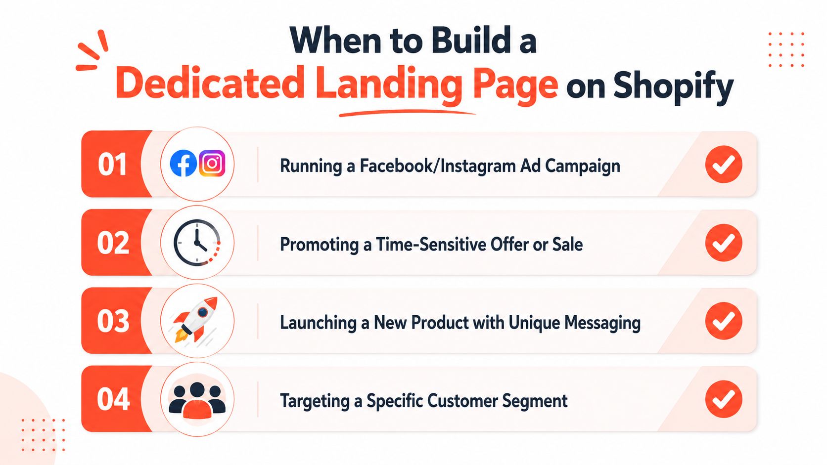
Paid social is the clearest case for a dedicated landing page. An Instagram ad for a starter kit should not send visitors to a broad collection where they must identify the advertised product, interpret the offer, and find the relevant details. The destination should carry the campaign's visual language, product selection, value proposition, and call to action from the first screen.
Use the campaign, not the page type, as the trigger
A separate page usually earns its development cost when the campaign requires a materially different experience:
The message needs tight matching: The ad, email, or creator post makes a promise that the standard product page does not express above the fold.
The audience needs different proof: First-time customers, gift buyers, professional users, or regional audiences may need different objections answered.
The offer has a single purpose: A product launch, pre-order, bundle, sale, or email capture initiative should not compete with unrelated navigation.
The experience needs a different sequence: A complex product may require education, comparison, reviews, and demonstration before the purchase module.
Seasonal promotions are another strong use case. A homepage banner can announce a sale, but paid traffic often needs more focus. A campaign page can organize eligibility, product selection, urgency, shipping expectations, and the exact action the visitor should take.
Product launches benefit from separation when the new item has unfamiliar positioning. A dedicated launch page gives the brand room to explain the problem, demonstrate the product, introduce reviews or early proof, and collect email interest without rearranging the whole store. It also creates a cleaner measurement surface, so the landing page conversion rate can be compared with the campaign's traffic and offer rather than hidden inside the store-wide average.
Avoid building pages for every minor variation
A new URL is not justified by a small wording change. When the offer, product, objections, and purchase path remain the same, one well-structured product page is easier to maintain and less likely to fragment reporting. Build around a meaningful change in intent, proof, or purchase flow.
Before development, place the ad headline, landing-page headline, primary CTA, and first proof point side by side. A mismatch indicates that the destination needs specialized structure. Interchangeable content points to an existing page that needs improvement instead. Track the resulting page separately from store-wide metrics, then test its headline, proof order, offer presentation, and CTA as its own CRO surface.
Choosing Your Shopify Landing Page Architecture
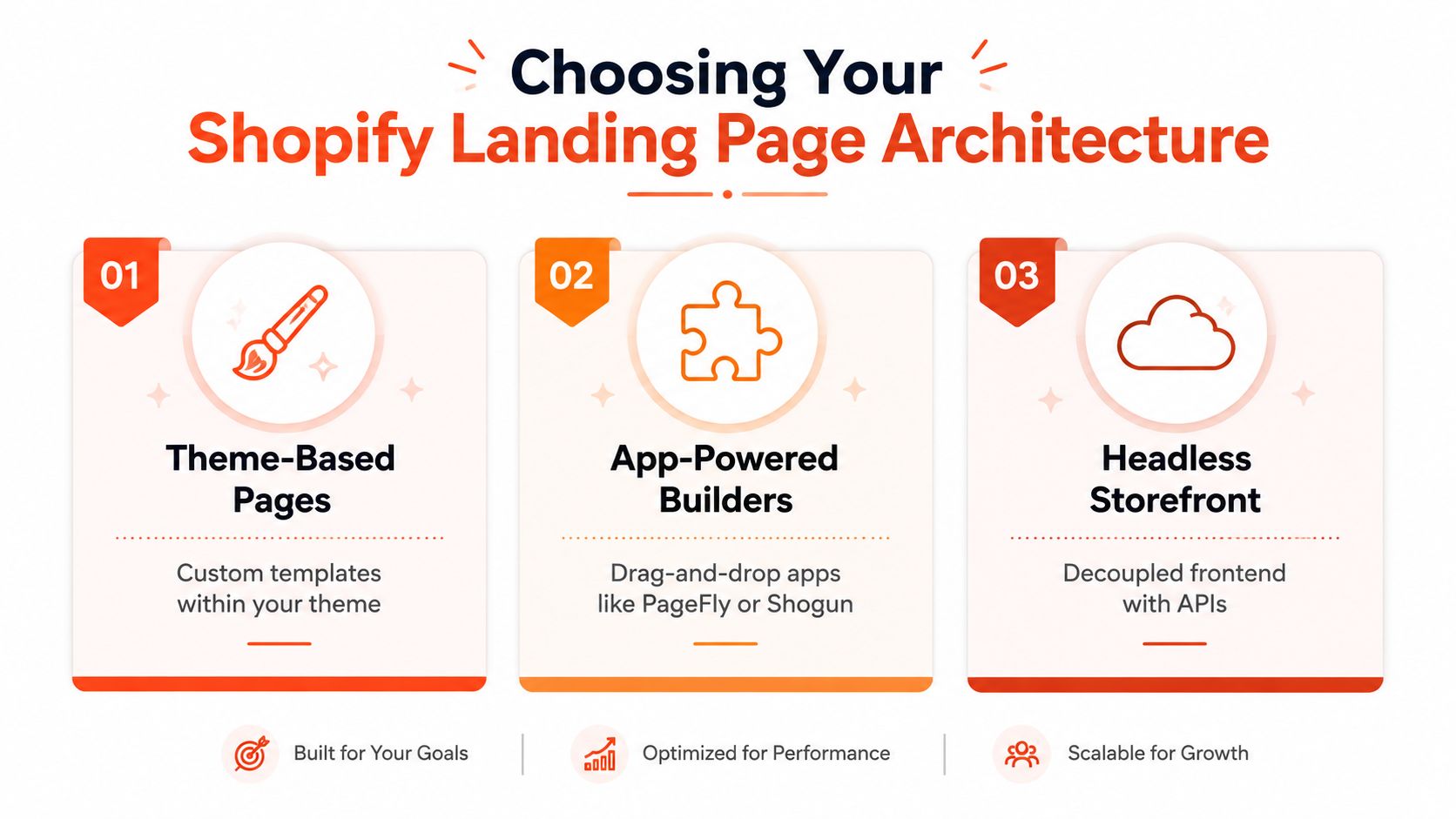
A Shopify landing page should be treated as its own optimization surface, not another theme variant. The right architecture depends on campaign velocity, design requirements, technical ownership, measurement needs, and how much complexity the store can support. Merchants generally have three practical choices: theme-based pages, app-powered builders, and headless storefronts.
Theme-based pages
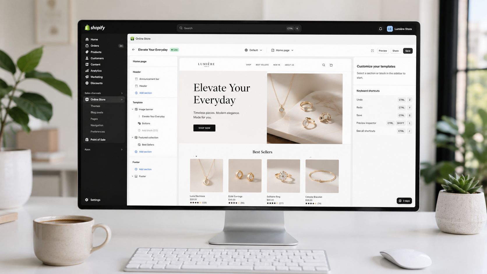
A custom JSON template within the existing theme is usually the cleanest starting point. Developers can assemble the page from reusable sections, control Liquid output, preserve Shopify's native product and cart behavior, and give marketers approved editing controls in the theme editor.
It suits brands that need repeatable campaign pages while keeping one design system and one commerce stack. The trade-off is constrained flexibility. If the theme's section architecture is poorly planned, every new landing page becomes a developer task, and inconsistent templates make page-level testing harder to manage.
Use our guide to Shopify theme sections and how to structure reusable components to decide which elements belong in reusable sections and which should remain specific to one campaign. Keep the template modular enough for testing, while preventing editors from combining sections in ways that break message hierarchy or tracking.
App-powered builders
Tools such as PageFly and Shogun give marketing teams visual control and faster page assembly. They work well for frequent campaigns when a frontend developer is not available for every copy, layout, or offer change.
The operational cost deserves attention. Builder apps may add scripts, duplicate styling systems, complicate responsive behavior, and create dependencies during a theme migration. They can also make conversion reporting harder to interpret if events, URL parameters, or checkout handoffs behave differently from the main store. Before committing, audit generated markup, app assets, tracking behavior, page speed, and the uninstall path.
Headless storefronts
Headless separates the frontend from Shopify's presentation layer and connects commerce functionality through APIs. It provides broad control over interaction design, rendering strategy, and content architecture, which can suit brands running multiple experiences or highly customized purchasing journeys.
That control comes with ownership requirements. Developers must manage deployment, caching, preview workflows, analytics consistency, accessibility, and integration behavior across the decoupled stack. For one campaign page, the overhead is rarely justified. Headless becomes a stronger fit when the landing page belongs to a wider composable storefront strategy and the team can maintain separate frontend operations.
A practical decision matrix:
Priority | Strongest fit | Main trade-off |
|---|---|---|
Fast delivery with native Shopify behavior | Theme-based template | Limited freedom outside the theme system |
Marketing autonomy and visual editing | App builder | App overhead and maintenance |
Maximum frontend control | Headless | Greater technical and operational complexity |
Choose the smallest architecture that supports the campaign and produces clean page-level reporting. A maintainable theme template often beats an elaborate build that the team cannot measure, update, or test independently from store-wide metrics.
Design and UX Principles That Drive Conversions
A high-performing Shopify landing page makes the next decision obvious. The design should reduce interpretation, not display every capability the theme can support.
Start with message match
Use the same core promise across the ad, headline, supporting copy, product imagery, and CTA. If an ad presents a bundle, the landing page should show that bundle immediately. If the ad speaks to a specific use case, the first screen should confirm that the visitor reached the right destination.
A generic headline such as “Shop our collection” wastes the strongest space on the page. A more useful structure identifies the outcome, the product or offer that enables it, and the action to take. Keep the CTA consistent, whether it says “Add the starter kit” or “Get early access.” Changing the action language from section to section makes the page feel less intentional.
Build a clear visual sequence
The first screen should usually contain the offer, primary product or lifestyle image, a concise explanation, a trust signal, and the primary action. The sections beneath it should answer objections in a deliberate order:
Clarify the benefit: Explain what changes for the customer.
Demonstrate the product: Use photography, video, or a comparison that makes the product tangible.
Resolve uncertainty: Address fit, materials, use, shipping, returns, or compatibility.
Add proof: Place relevant reviews, user-generated content, or credible mentions near the claims they support.
Repeat the action: Give visitors another clear route to purchase or sign up.
Navigation deserves a conscious decision. Removing it can keep paid traffic focused, but it may frustrate returning customers or visitors who need reassurance from the broader site. A restrained header with logo, support access, and an anchor-based page menu can preserve orientation without turning the page into a browsing hub.
Design for Shopify's actual purchase path
On product-focused pages, connect the CTA to the product form rather than creating a decorative button that sends visitors on another hunt. Confirm variant selection, subscription choices, inventory states, accelerated checkout behavior, discount logic, and cart drawer interactions on mobile.
Trust signals should appear where anxiety occurs. Shipping and returns belong near the purchase decision, while ingredient, material, or compatibility details may need to appear earlier. A sticky mobile CTA can help on long pages, but it shouldn't cover variant selectors, consent controls, or essential content.
Use accessible heading hierarchy, meaningful alternative text, visible focus states, sufficient color contrast, and labels that remain understandable without visual context. These choices support people using assistive technology and make the page easier for everyone to scan.
Integrating Apps and Tracking for Complete Measurement
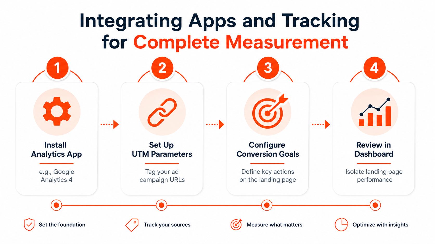
Start every campaign with a measurement contract. Define the landing URL, traffic source, campaign naming convention, primary conversion, and supporting events before launch. Shopify's Analytics can show overall online store conversion and filter results by page URL, which helps estimate performance for a specific landing page (Shopify's guide to landing page conversion rate). Keep that page-level view separate from the store-wide rate when deciding whether to scale traffic.
Use consistent UTM parameters across paid social, search, email, affiliate, and creator campaigns. The report should separate intended campaign visits from unrelated direct or organic traffic. Record the complete path from arrival to revenue:
Landing view: The visitor reaches the campaign URL.
Engaged interaction: The visitor selects a variant, opens an FAQ, watches product media, or scrolls to a meaningful section.
Intent action: The visitor clicks the purchase CTA, submits an email, starts a quiz, or adds a product to cart.
Commerce outcome: The visitor completes checkout, with order and product details connected to the campaign where the platform permits.
Google Analytics 4 supports event analysis, while Shopify Analytics supplies the commerce context. Ad platforms can use different attribution windows, so their totals should not be combined as one result. Choose a primary reporting view for budget decisions, then use channel reports to diagnose delivery and audience quality.
Add apps only when they improve the decision
Lead-capture tools, product quizzes, reviews, personalization, and post-purchase systems can support conversion work, but each app adds code, configuration, and failure points. A quiz should pass its recommendation cleanly into the product and cart experience. A lead form should record consent, source, campaign, and the promised follow-up, rather than storing an email without context.
Presidio's Quiz Kit is one option for stores that need AI-powered product recommendations and lead capture. Its implementation still requires event naming, consent handling, data ownership decisions, and performance review.
Build the dashboard around commercial outcomes. Use clicks and engagement events to locate friction, then evaluate completed orders, contribution margin, subscription starts, or qualified leads to decide whether the campaign merits more investment. This separates landing-page optimization from theme-level reporting and gives each test a measurable business outcome.
Mobile Speed and Accessibility as Conversion Levers
Mobile performance is not a cosmetic concern. A 2026 industry summary cited by Shopify says mobile conversion can fall by 20% for each additional second of loading time, and it reports that 68% of Shopify stores load in four or more seconds on mobile (Shopify's FAQ guidance). Those figures are benchmark claims from the cited industry summary, not a guarantee for every store, but they show why a beautiful page can still fail commercially.
Start with the largest causes of delay. Compress hero images, serve appropriately sized assets, avoid autoplay video above the fold, remove unused app scripts, and inspect whether third-party widgets load before the primary content. Test real mobile layouts, not only desktop previews in the Shopify editor.
Accessibility improvements often produce the same practical benefits as speed and usability work. Clear headings help screen-reader users and scanners. Descriptive buttons clarify the action. Adequate contrast improves readability in bright conditions. Keyboard access exposes interaction bugs that touch-only testing misses.
Shopify's guidance also connects FAQ content with usability, accessibility, and schema markup for search visibility (Shopify's FAQ guidance). Use FAQs to answer real purchase objections, keep the content visible and readable, and implement structured data only when it accurately represents the page.
For teams designing mobile-first campaign destinations, these mobile-first design principles for a winning link in bio page offer useful interaction guidance that also applies to Shopify landing pages. A technical review should include Shopify performance optimization, but the priority order should follow customer impact, not a generic score alone.
Your CRO Testing Roadmap for Shopify Landing Pages
A landing page testing program should begin with measurement, not button colors. First verify that the URL, campaign parameters, page-view event, add-to-cart event, checkout outcome, and device reporting work consistently. Without that foundation, a test result may reflect tracking noise or traffic mix rather than a better experience.
Build the roadmap in phases
Phase one focuses on message and friction. Test the headline and supporting promise against the traffic source, then test the hero product image, offer presentation, primary CTA wording, and the visibility of shipping or returns information. Change one major variable at a time so the result has an interpretable cause.
Phase two addresses proof and product understanding. Test review placement, user-generated content, comparison sections, demonstration video, FAQ order, and the position of the purchase module. Keep the audience and campaign definition stable while you evaluate the page.
Phase three introduces targeted experiences. Consider campaign-specific blocks, customer-segment messaging, quiz entry points, or returning-visitor treatments only after the base page has a clear control and dependable reporting. Personalization can multiply maintenance work if the team creates variations without a naming and retirement process.
Prioritize tests with a simple score based on potential impact, implementation effort, confidence in the problem, and available traffic. Don't call a winner because one day looks positive. Account for device, source, offer eligibility, and purchase lag, then validate the result against completed commerce outcomes.
The landing page A/B testing best practices from Keywordme provide a useful reference for experiment discipline. Shopify-specific implementation details, including theme templates and testing workflows, are also covered in Shopify A/B testing guidance.
A practical roadmap starts with one control page, a documented hypothesis, and a small set of high-friction questions. Keep the winning variation only when it improves the defined primary outcome without creating a meaningful problem in checkout, accessibility, speed, or margin.
Presidio helps Shopify and Shopify Plus brands build campaign-ready themes, landing page templates, custom apps, and CRO testing programs that connect storefront changes to measurable outcomes. Visit Presidio to discuss a landing page audit, performance review, or testing roadmap for your store.

Jamie, Presidio’s Designer, leads the practice alongside Johnnie. With over 10 years of e-commerce experience, Jay is a Shopify expert, known for crafting innovative solutions that prevent tech debt.
Jaime
Senior Product Designer, 2020